I build, manage and grow products
I've worked in Product, Growth, Business Design and Advertising. I've collaborated with startups like Plum and FindDoc, as well as corporates such as Shangri-La Hotels, Express VPN and Generali.

GoodFinds
2026GoodFinds turns restaurant recommendations from people you trust – influencers, guides, chefs and friends – into a live map.
Histoline
Sep 2026Pin a year and see what eighteen civilizations were doing at once. Every dated item checked against Wikidata.
Acquisitions
2026Screenshot an outfit and find every piece in it, or a cheaper version.
Things I built because I wanted them to exist, and work I did for companies.
Since 2026 most of the personal ones are built with AI, which changed what one person can ship in a weekend. Each entry links to the live project, a write-up of the problem, the decisions and what I learned.
A Restaurant Map Where Every Pin Names Its Source
GoodFinds turns restaurant recommendations from people you trust – influencers, guides, chefs and friends – into a live map.
A public board of everything I am building with AI, and a private one behind it
Fifty-five ideas on one kanban, each scored, rated for how well AI can build it, and given a five-part case study. Visitors see the board; I see the same address with every card open, editable, and saved back to the source.
Pin a year and see what eighteen civilizations were doing at once
A comparative world-history timeline from 3500 BC to today. It began as a weekend build covering two centuries in one file, and grew into a checked, sourced product where every dated item was cross-checked against Wikidata.
An app that finds the exact product in an outfit you screenshot
A social shopping app where you follow fashion tastemakers and search by photo or text to find the pieces in their outfits, or an affordable alternative.
Filing posts into journals instead of one public feed
A journaling social network that files posts into privacy-scoped journals instead of one feed, with plain heuristics standing in for most of its AI until a model earns its place.
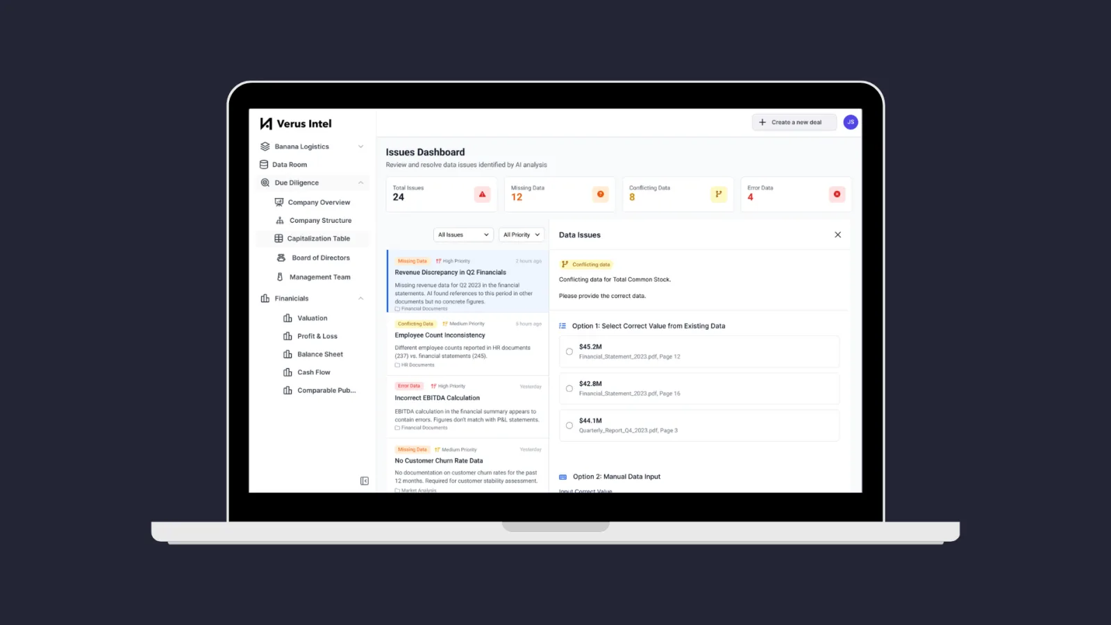
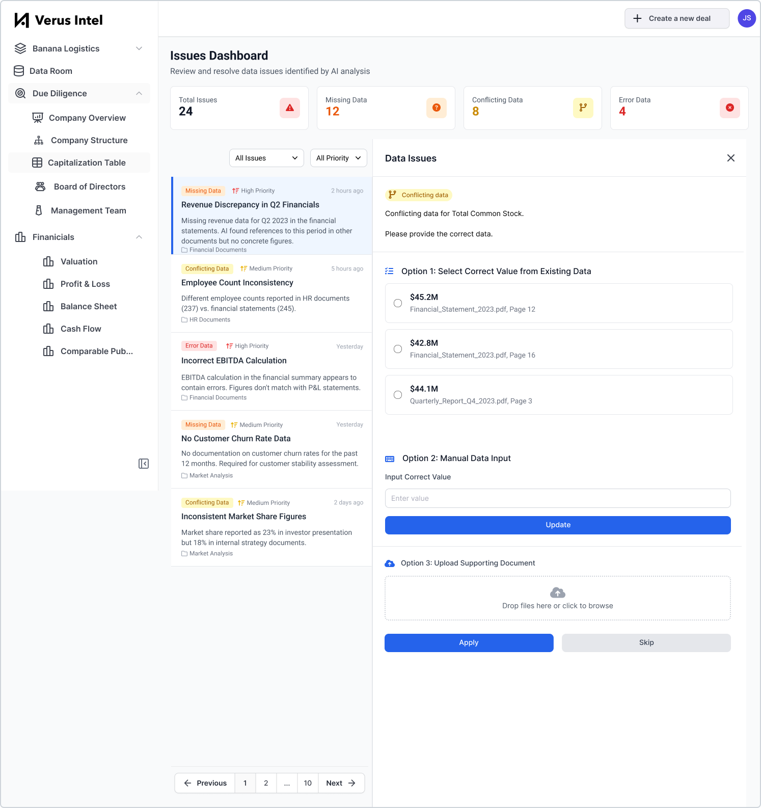
Designing an AI tool for private equity due diligence
Third place winner in 2 out of 2 categories at Techstars Startup Weekend San Francisco AI 2024.
Founding an AI matching platform for finding project collaborators
AI-enabled platform connecting individuals with shared interests to collaborate on passion projects. HKSTP-funded. 263 registered users, 21% WAU.
Finding PMF, Growing from 0 to 10,000 Paid Daily Orders in 2 Months
Found product-market fit for Plum, growing from 1,000 daily unpaid orders to 10,000 daily paid orders and scaling to 130k users in 6 months.
Identifying Opportunities for Increased Operational Efficiency and Enhanced Customer Experience
Led research and discovery for the world's #2 luxury brand, surfacing 18 initiatives to improve operational efficiency.
Developing an Innovation Operating Model for a Fortune 500 Company
Created a KPI-driven product operating model. Roadmap churn was cut from 45% to 20%.
Nothing matches those filters.
A mistake in Histoline, an idea for GoodFinds, something broken on this site. No name needed.
The podcasts, newsletters and books I keep going back to.
- Invest Like the BestPatrick O'Shaughnessy
- Lex Fridman
- 20VCHarry Stebbings
- Lenny's Podcast
- Y Combinator Startup Podcast
- a16z
- The Diary Of A CEOSteven Bartlett
- TLDR
- The Information
- First Round Review
- Lenny's Newsletter
- Paul Graham
- Casey AccidentalCasey Winters
- Itamar Gilad
- The Product Guy BlogJeremy Horn
- Bringing the DonutsKen Norton
 Empire of AIKaren Hao
 Elon MuskWalter Isaacson
 The Great TransformationChen Jian and Odd Arne Westad
 The Story of ChinaMichael Wood
 Chaos MonkeysAntonio García Martínez
 Lean AnalyticsAlistair Croll and Benjamin Yoskovitz
 Running LeanAsh Maurya
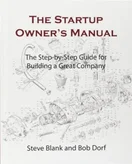 The Startup Owner's ManualSteve Blank and Bob Dorf
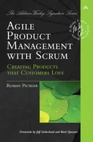 Agile Product Management with ScrumRoman Pichler
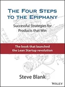 The Four Steps to the EpiphanySteve Blank
 David and GoliathMalcolm Gladwell
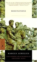 MeditationsMarcus Aurelius
 The Obstacle Is the WayRyan Holiday
 The Back of the NapkinDan Roam
 Growth Hacker MarketingRyan Holiday
 HookedNir Eyal
 Atomic HabitsJames Clear
 The Pyramid PrincipleBarbara Minto
 DrawdownPaul Hawken
 The Origins of Political OrderFrancis Fukuyama
 What It TakesStephen A. Schwarzman
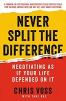 Never Split the DifferenceChris Voss
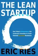 The Lean StartupEric Ries
 The Innovator's SolutionClayton Christensen and Michael Raynor
 The Innovator's DilemmaClayton Christensen
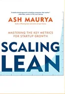 Scaling LeanAsh Maurya
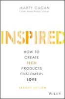 InspiredMarty Cagan
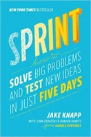 SprintJake Knapp
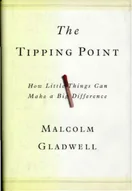 The Tipping PointMalcolm Gladwell
 PrinciplesRay Dalio
 BlinkMalcolm Gladwell
My Role
Product Lead
- Cross-Functional Collaboration: Worked with 2 Designers, 6 Engineers, and 1 Data Analyst
- Roadmapping & Vision: Established and maintained the consumer-facing app product roadmap, aligning priorities with overall business objectives, and guiding feature development
- User Research & Validation: Led user interviews and testing
- Stakeholder Alignment: Communicated strategy and progress across departments and executive teams
- Release Management: Planned releases from concept to launch; managing sprints and collaborating cross-departments
- Data-Driven Experimentation: Setup and trained data analytics team. Defined key metrics and dashboards to measure outcomes. Leveraged insights for continuous improvement
Growth & Marketing Lead
- Team Leadership: Managed a growth squad of 3 and marketing team of 6, setting goals and processes for initiatives
- Growth & Marketing Strategy: Led growth and marketing strategies focused on user acquisition and retention
- Data-Informed Experimentation: Established a culture of rapid, data-informed testing
- Managed Rebrand: Led collaboration with an external agency to manage Plum's rebranding
Championed Vision Company-wide
- Evangelized "critic-rated meals delivered daily," ensuring alignment company-wide across teams including logistics, menu selection and marketing
- Conducted company-wide workshops and interdepartmental strategy sessions
- Authored the company culture handbook, codifying values and aligning them with key business drivers
Context
Plum, a nascent 3-month old, 30-person company, aimed to disrupt the food delivery landscape in Hong Kong, a market dominated by well-established players like Food Panda and Deliveroo. The founder's vision involved delivering a daily rotating menu of five dishes from a variety of restaurants around the city to working professionals in key business districts.
Main Challenge
Despite the initial strategy of acquiring users by offering free meals, Plum struggled to convert users into paying customers. At peak, the team had 1,000 unpaid daily orders and negligible paid orders.
What I Did
#1 Crack product-market fit
Recognizing the local foodie culture's preference for exclusive and high-quality meals, I proposed a pivot towards a gourmet-focused value proposition. This involved sourcing critic-rated dishes, which differentiated Plum from competitors.
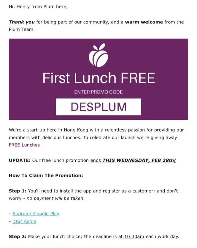

We tested this idea by changing the messaging on our flyers and immediately saw an increase in paid orders. Following this success, we modified our meal sourcing strategy to focus on critic-rated dishes.
Within 2 months, Plum achieved product-market fit, scaling from 1,000 daily unpaid orders at peak to 10,000 daily paid orders and boosting retention from a stagnated 17% to 46%.
#2 Ensure strategic vision is executed company-wide
Executing on the strategic vision of "critic-rated meals delivered daily" required coordination across the entire organization, from menu selection to product development to operations.
To ensure company-wide alignment, I regularly organized workshops and departmental strategy sessions. These meetings were designed to identify opportunities to manifest our vision at every user touchpoint and to assess the effectiveness of past initiatives.
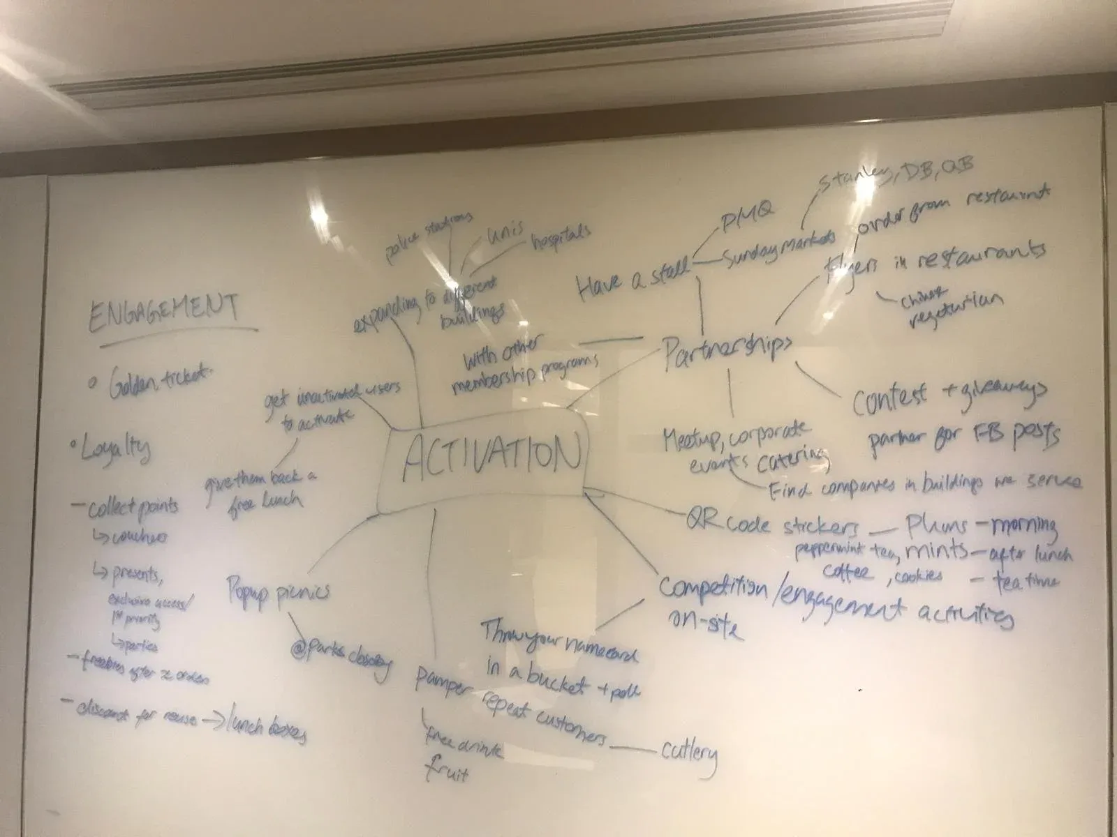
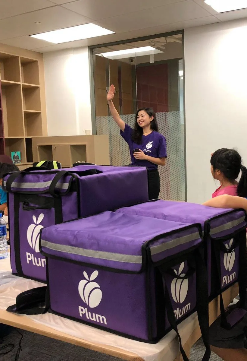
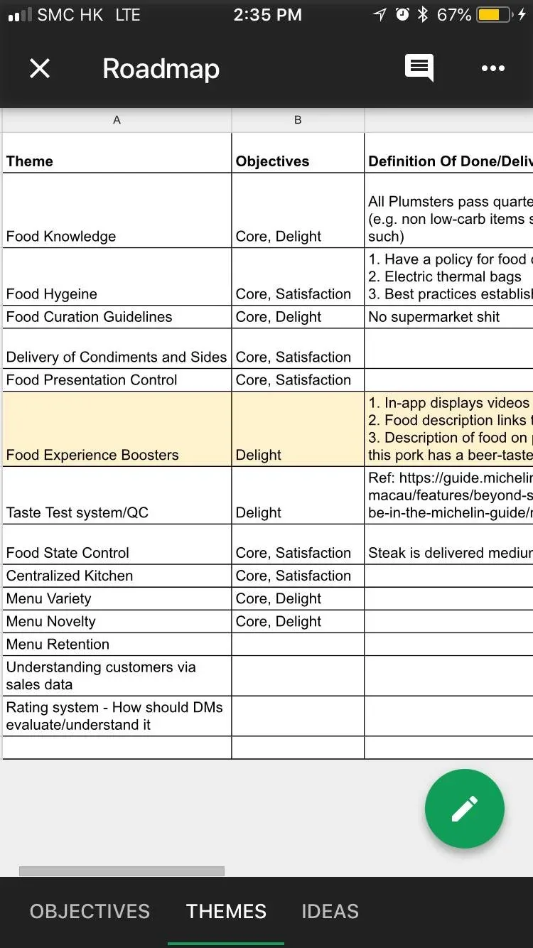
For example, I led our menu selection team in developing a data-driven methodology that guided dish selection in support of specific business goals such as acquisition, retention, and branding. I also created a company culture handbook, which helped both new and existing employees embody our values and deliver on our promise at every touchpoint, from delivery to customer service.
#3 Product development, growth and branding
As product and growth lead, as well as advisor to the marketing team, I mentored team members and ran weekly strategy review meetings.
Key product initiatives:
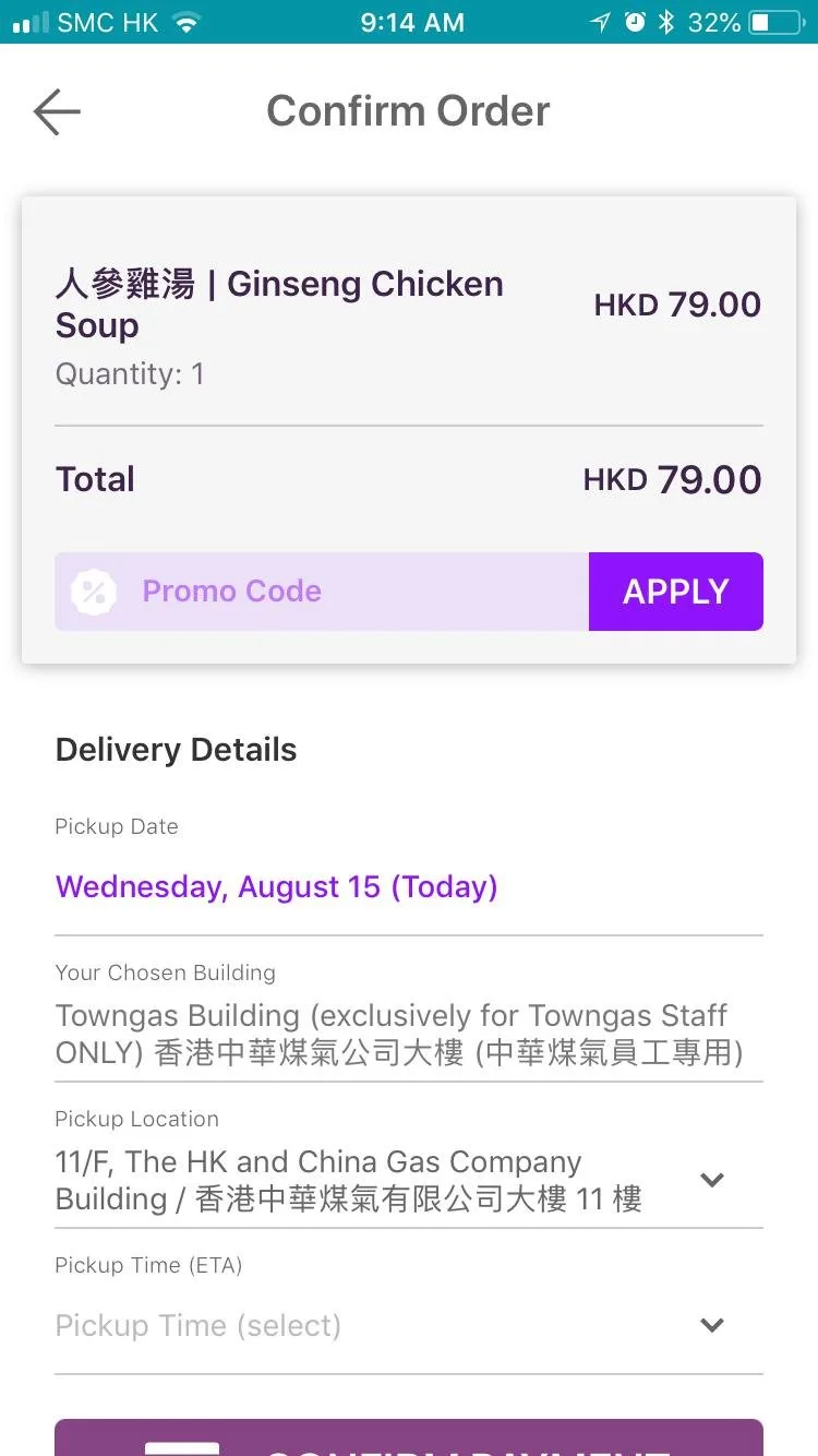
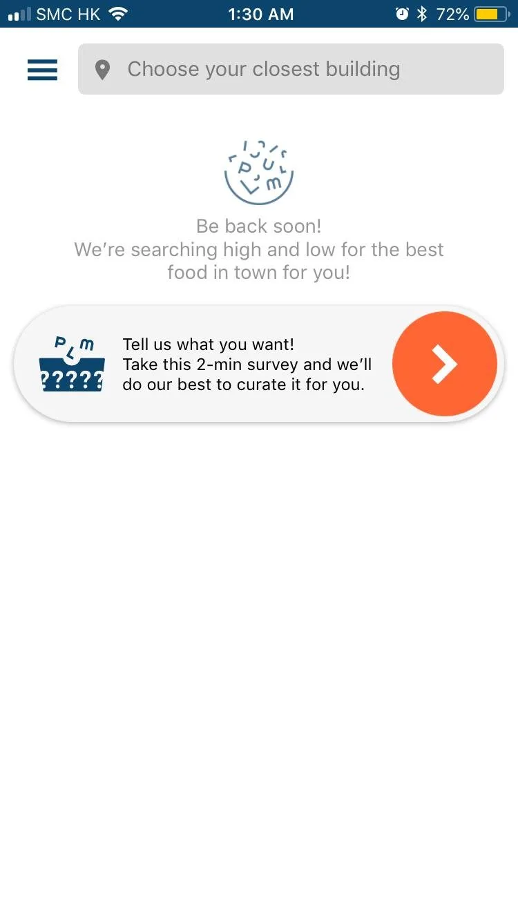
- Collaborating with design and engineering on development of mobile app
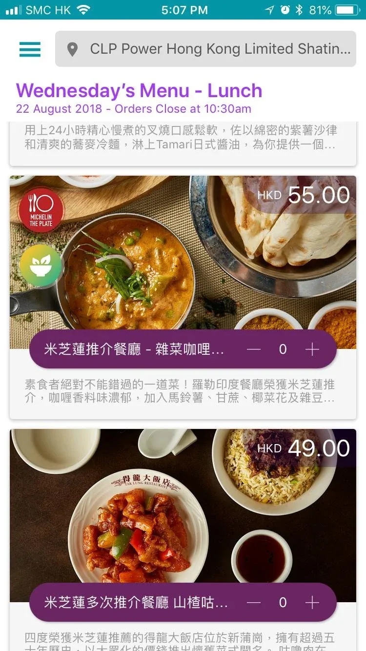
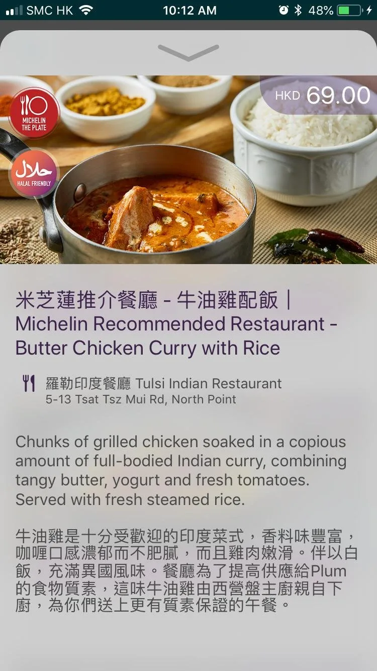
- Labelling Michelin-recommended dishes with Michelin logo, resulting in 237% increase in orders
- Conceived and championed a menu selection strategy, driving over 11.8% month-over-month growth in orders
- Became the first food delivery app in Hong Kong to implement a feature allowing users to select their desired tip amount and opt out of receiving cutlery
- Set up and trained first data analytics team member, guiding team on which metrics to track and how. Defined company OKRs and analytics dashboard. Created retention cohort charts.
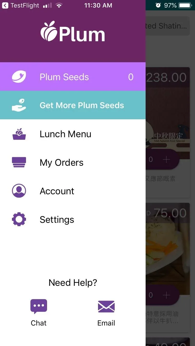
Key growth initiatives:
- Loyalty program
- Referrals program
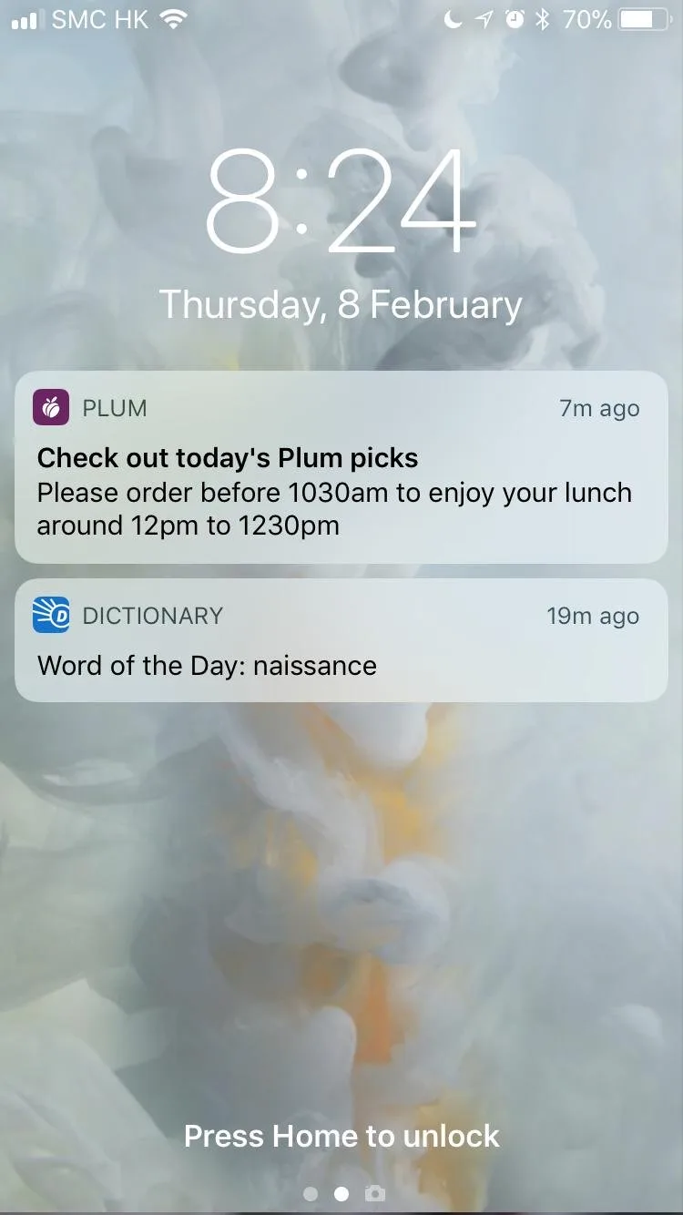
- Daily notifications to place orders
- Notifications for wishlisted items

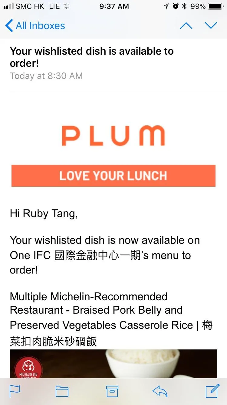
Additionally, I managed Plum's rebrand in partnership with an external agency.
Before Plum's rebrand

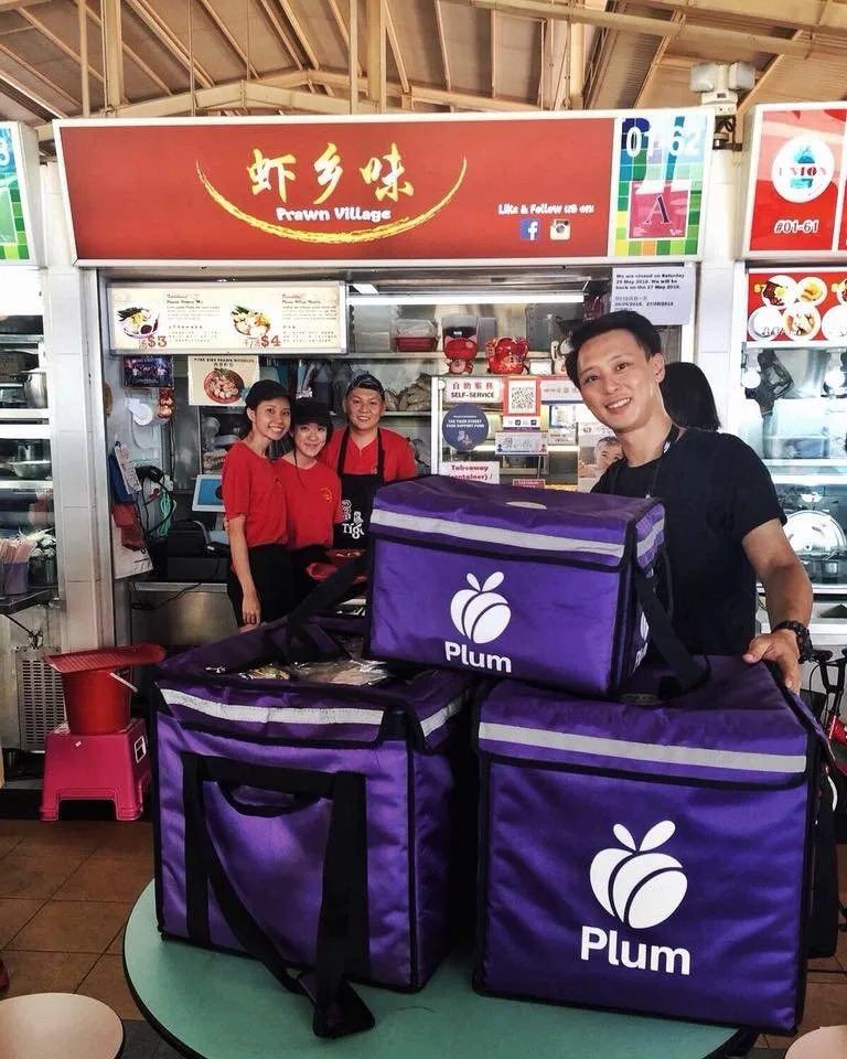
After Plum's rebrand


Impact
- Found product-market fit in 2 months, growing from 1,000 daily unpaid orders to 10,000 daily paid orders
- Scaled to serve 130k users and 10k daily orders within 6 months in Hong Kong, Singapore, Sydney, and New York
- One of Hong Kong's 10 most popular apps in 2018
- As seen in SCMP, The Standard, Retail News Asia



Identifying Opportunities for Increased Operational Efficiency and Enhanced Customer Experience
Ruby's Role
Research
- Team alignment interviews
- User research (interviews, secret shopper, job shadowing, surveys)
- Journey mapping and service blueprints
Discovery
- Innovation ideation
- Solution testing with staff and users
- Proposed solutions expected to cut backoffice hours 7.5% (~3 hours per store associate per week) and drive 10–25% incremental store revenue
Challenge
A leading global luxury retailer was negatively impacted by the COVID-19 pandemic. With less foot traffic, the retailer wanted to optimize retail operations efficiency so staff could dedicate more time to elevating the customer experience.
Six Key Opportunities
Research and discovery surfaced 18 initiatives across six workstreams. These are the six with the highest expected impact.
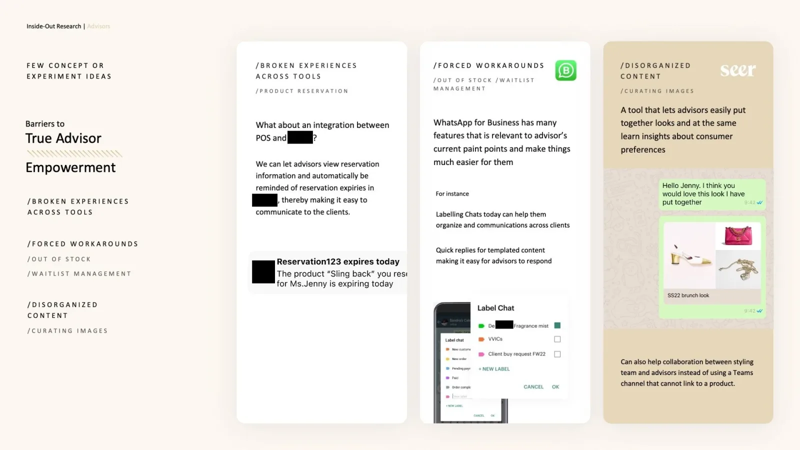
#1 WhatsApp for Business
Problem: Associates using personal messages with ad-hoc notes; fragmented history.
Solution: WhatsApp Business Platform with labels, notes, templates.
Impact: Associates estimate saving roughly 60–90 mins a week on manual note-taking and organization. Status: added to development roadmap.
#2 Digital Queue Ticketing
Problem: Manual queuing; waits at peak of around an hour.
Solution: Registration by app or web with SMS or call notifications, so customers can leave and come back.
Outcome: Prototype tested with staff and customers; added to the development roadmap.
#3 Centralized Product Styling Content Hub
Problem: Styling data fragmented across multiple platforms.
Solution: Consolidated app with photo uploads and filtering by customer characteristics.
Impact: Styling resource usage increased from 60% to 80% of interactions; search time dropped from ~6 mins to ~3 mins.
#4 System Integration
Problem: Separate POS, mobile POS, IMS systems responsible for approximately 72% of store associates' workflow issues.
Solution: Update and integrate systems.
Impact: Associates spend about 3.5 hours per week on duplicate data entry and error correction. Integration projected to reduce this by ~57%, to around 1.5 hours per week, plus 10–25% revenue uplift potential.
#5 Employee Feedback Platform
Problem: Associates struggling to document and recall issues.
Solution: Self-service survey form.
Impact: 66% of 39 associates surveyed wanted the tool. 2-week pilot produced 22 actionable issues versus historical 5–7 per month. Staff reduced reporting time from 1-hour weekly meetings to just 5–10 minutes per person per week.
#6 Predictive Personalization
Opportunity: 80% of customers expressed interest in personalized recommendations.
Solution: Predictive analytics platform integrated with customer profiles.
Impact: Recommendation passed to headquarters for future consideration.
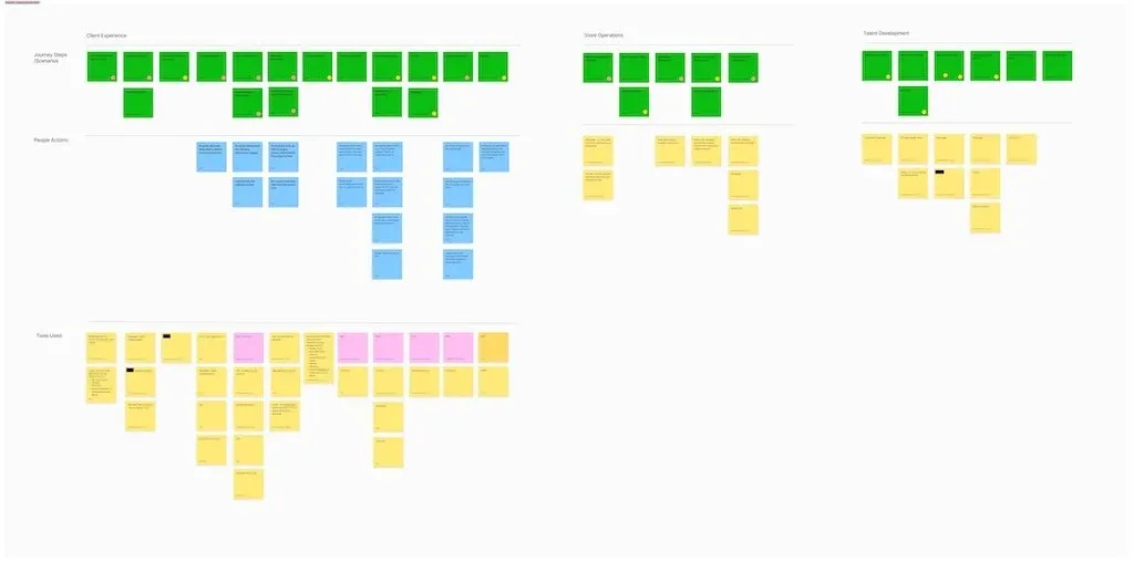
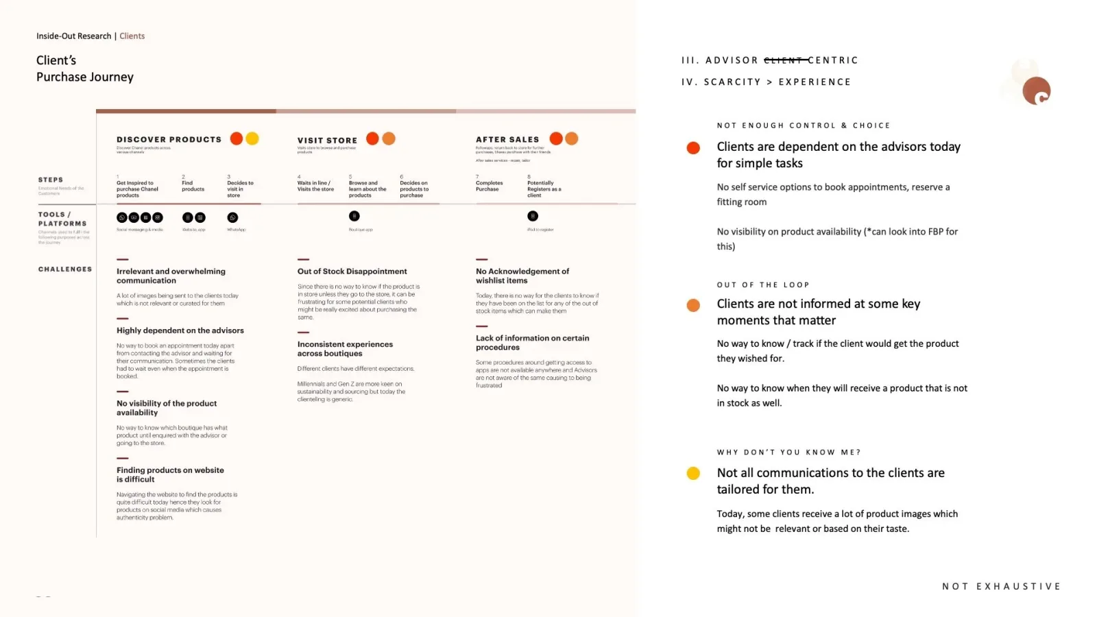
Because the confidential nature of this work, I'm limited in the amount of context I can share. Reach out for a full case study.
Developing an Innovation Operating Model for a Fortune 500 Company
Challenge
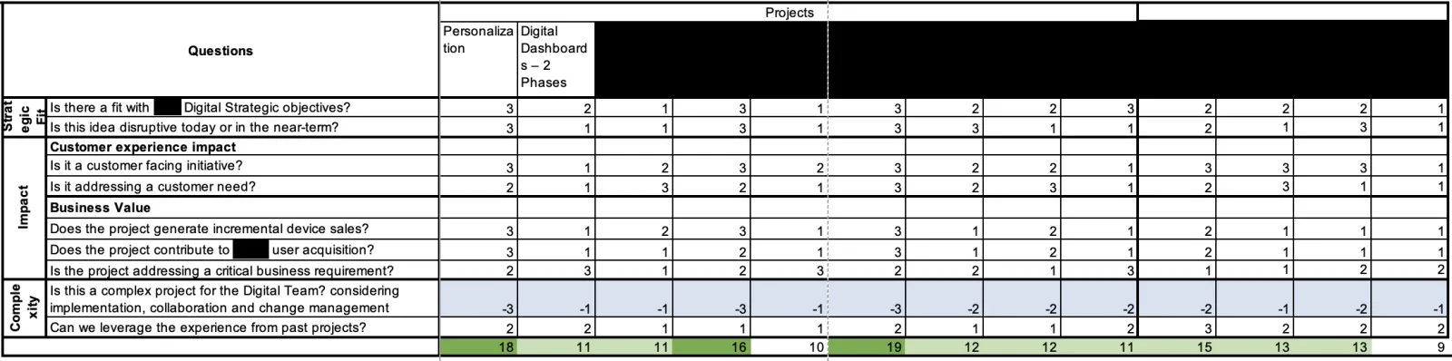
The client team faced a high volume of feature requests from other departments and had difficulty prioritizing these alongside their own initiatives. They also struggled with rationalizing their prioritization decisions and quantifying their impacts for management. In practice, work was prioritized on gut feel rather than on estimated impact against pre-agreed goals.
Ruby's Role & Strategic Approach
Associate manager on a 20-person consulting team embedded with the client's Digital team, working alongside a manager on this workstream.
Phase 1: Research
- Led interviews with five stakeholders — the head of department, two senior leaders on the team and two on neighbouring teams — and cross-functional workshops to map pain points and define success metrics
- Conducted job shadowing to document as-is workflows and bottlenecks
- Key Insight: 60% of "urgent" requests lacked measurable outcomes or conflicted with annual OKRs
Phase 2: Framework Design
- Architected a RICE-based prioritization framework that measured impact based on strategic team and organizational goals
Phase 3: Operationalization
- Trained 11 analysts in hypothesis development and A/B test design, standardizing experimentation practices
- Implemented and facilitated bi-weekly standups, bi-monthly triages, and quarterly sessions for ideation workshops, roadmap reviews, and retrospectives to compare projected versus actual outcomes for continuous refinement
- Built lightweight tracking via automated Jira scoring
Impact
Roadmap churn was cut from 45% to 20%.
This new framework enabled the Digital team to objectively identify high-impact features and communicate the rationale to management and other departments. The result was a significant improvement in the Digital team's ability to deliver on its strategic goals.
The operating model was subsequently adopted by four other departments.
Founding Collaborito, an AI matching platform for finding project collaborators
Overview
Collaborito is an AI-enabled platform that connects individuals with shared interests to collaborate on passion projects. Backed by the Hong Kong Science and Technology Parks (HKSTP), it currently has 263 registered users with 21% WAU.
Matching works from onboarding answers and an optional deeper profile covering goals and motivation, personality on a 1–5 self-rating, and hard and soft skills. A model scores compatibility and returns matches with guidance.
Ruby's Role
- Team Building: Recruited Shiwen Ai, a full-stack AI engineer from Nvidia, as CTO (May 2024, part-time), and assembled a UI/UX designer and two software engineering interns
- Product Vision & Business Strategy: Established product vision, business model, and roadmap
- Pitch Deck & Financial Model: Created investor-facing pitch deck and financial projections
- Product Design: Led product design with iterative user feedback sessions
- Go-to-Market Strategy: Planned and executed go-to-market strategy: a small Instagram/Facebook ad test validated the message (7% CTR, 11% landing-page conversion), then organic acquisition through Reddit posts, product-launch sites, and one-to-one emails and DMs
- Partnerships: Signed letters of intent with OWOW (28,000 members) and What You Building (200)
Design Iterations
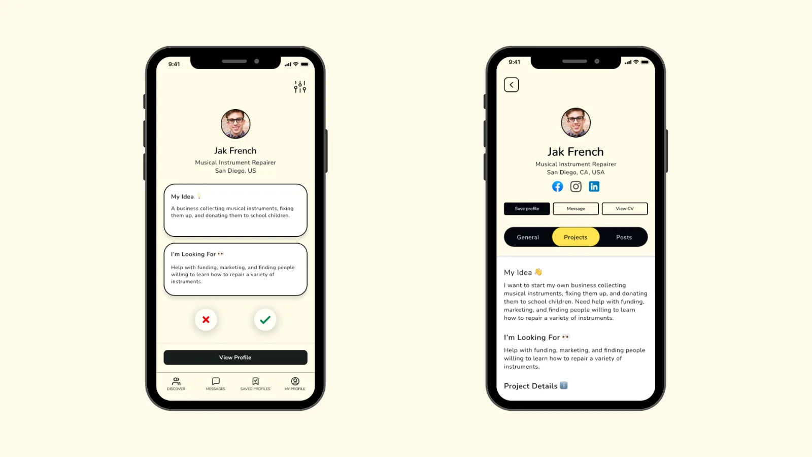
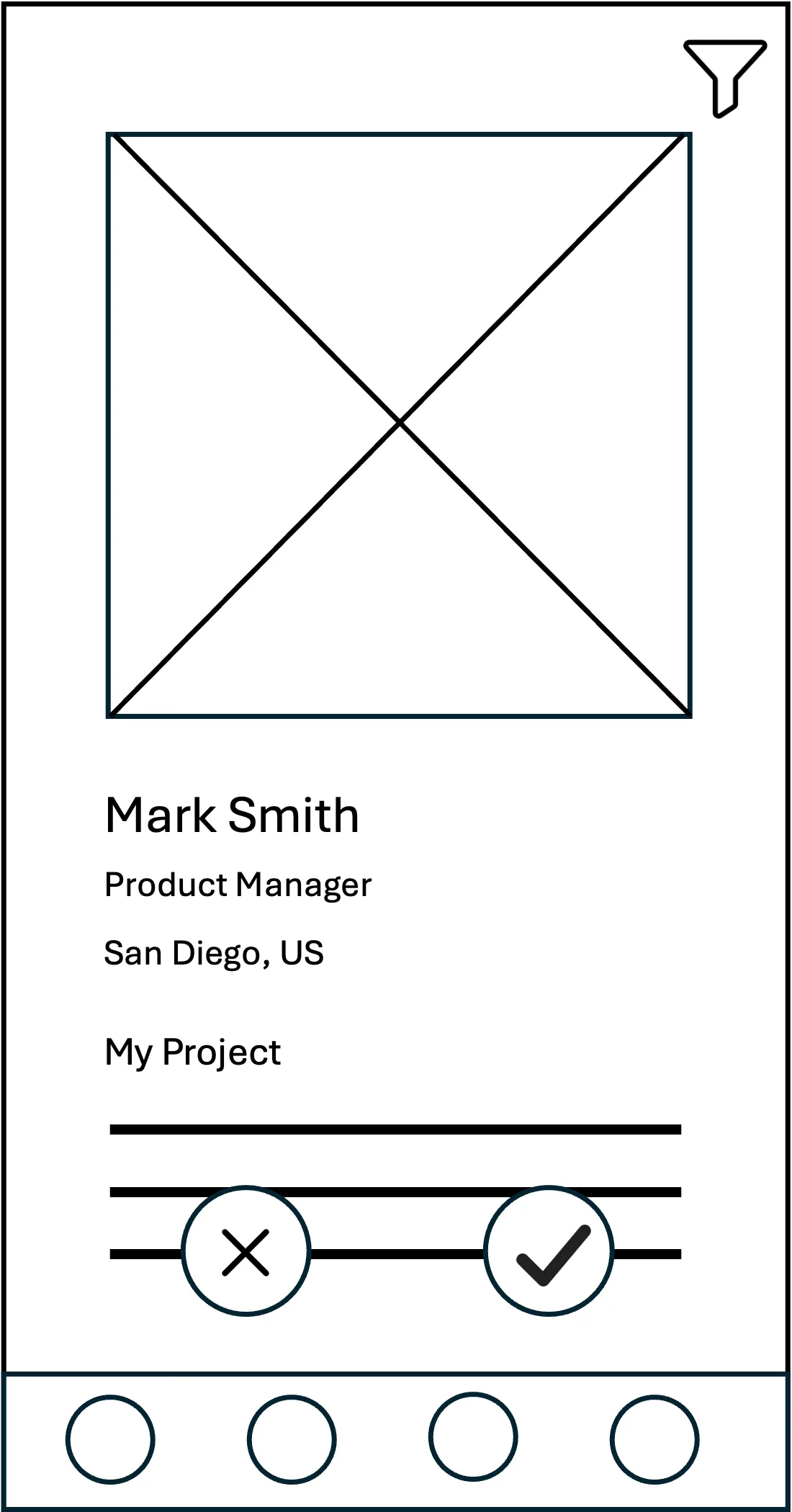
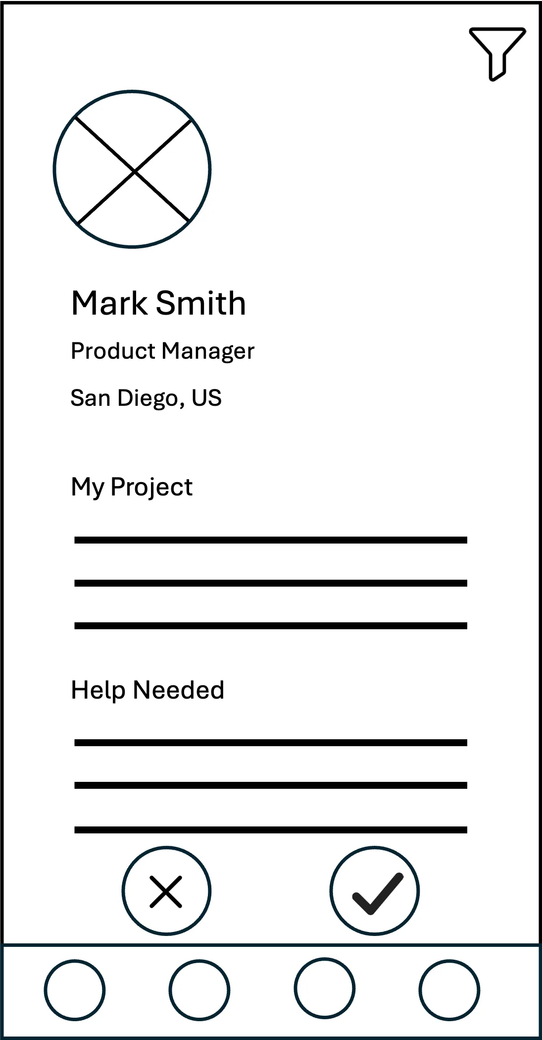
#1 Small Avatars
We chose smaller avatars to emphasize user information (e.g., skills, sought-after roles) rather than profile pictures
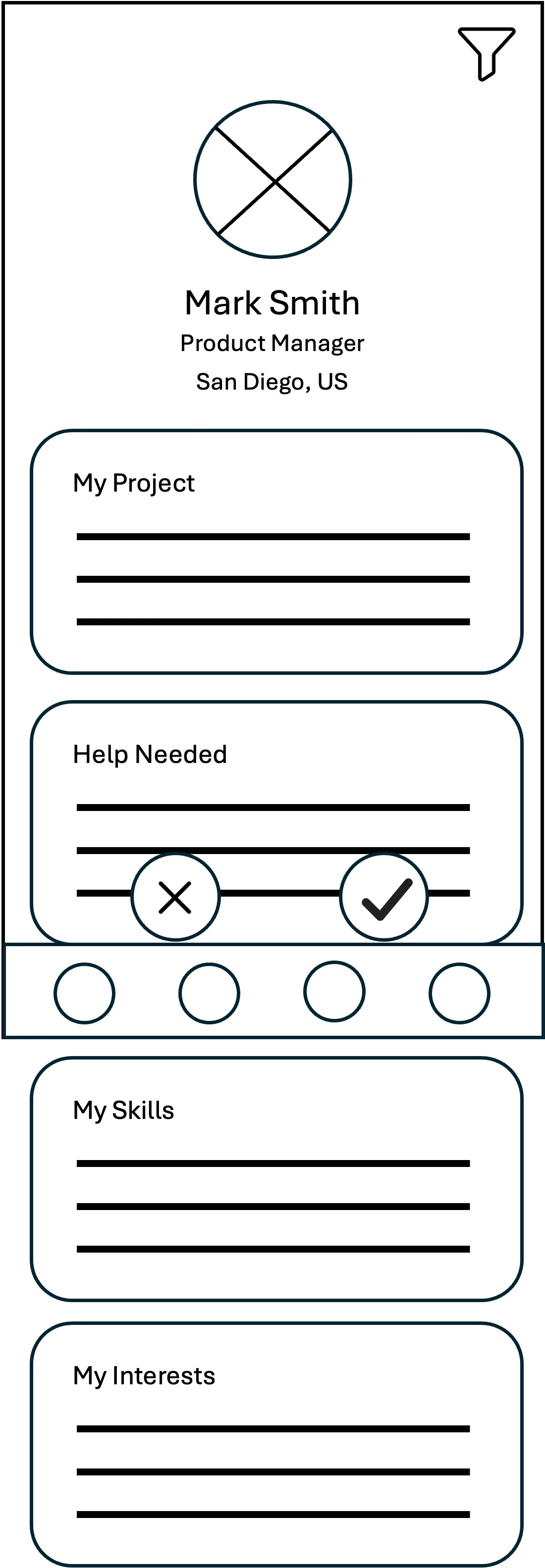
#2 Bordered Textboxes
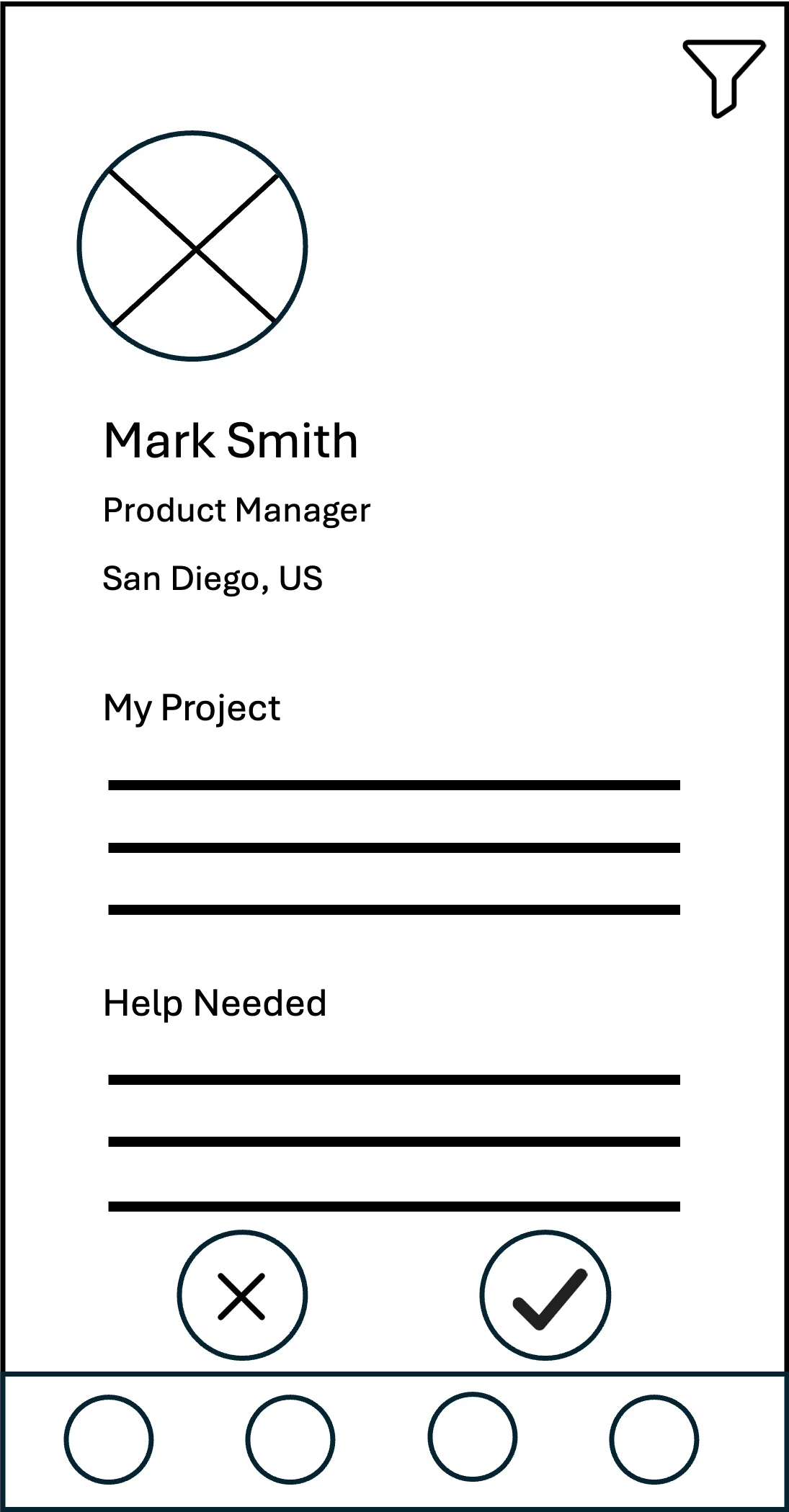
Bordered textboxes reduce information overload and strengthen visual hierarchy
Goal: Design efficient profile cards displaying project details and contributor skills
Challenge: Information overload, visual hierarchy, user engagement
Process: Three steps — Layout Experiments, User Research, Refinement
Key Insights:
- Users took 57% less time to read text presented in bordered text boxes versus continuous blocks
- 33% increase in testers describing the layout as straightforward and easy to navigate
#3 UGC Posts & Newsfeed
Deprioritise UGC posts and newsfeed — preferred
Considering the small user base expected at launch, we have deprioritized User-Generated Content (UGC) posts and the newsfeed feature to focus on core matching functionality.
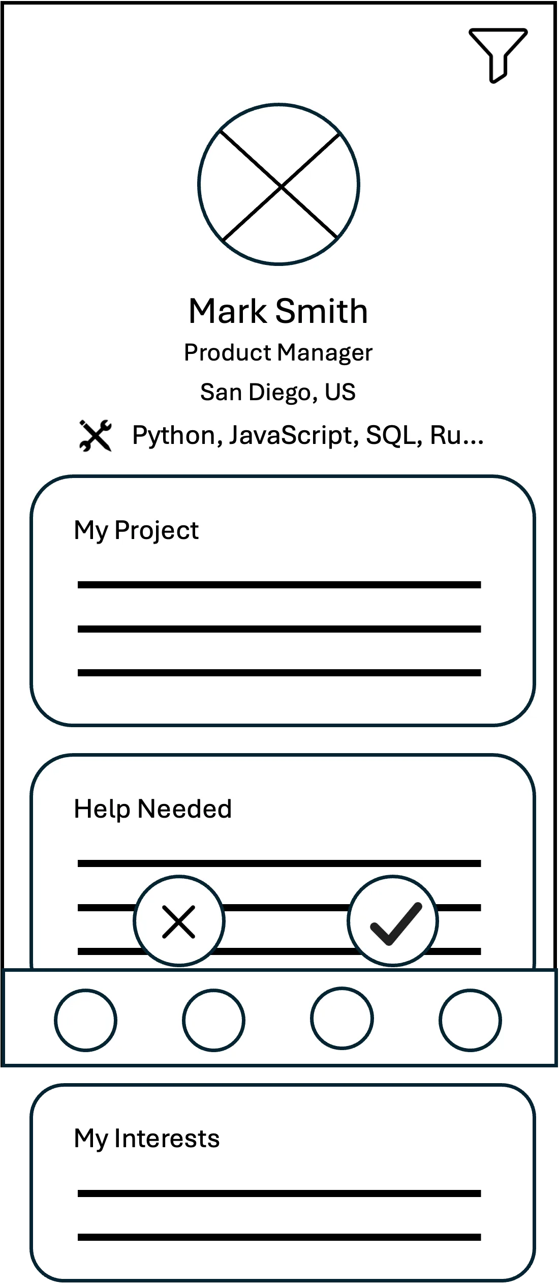
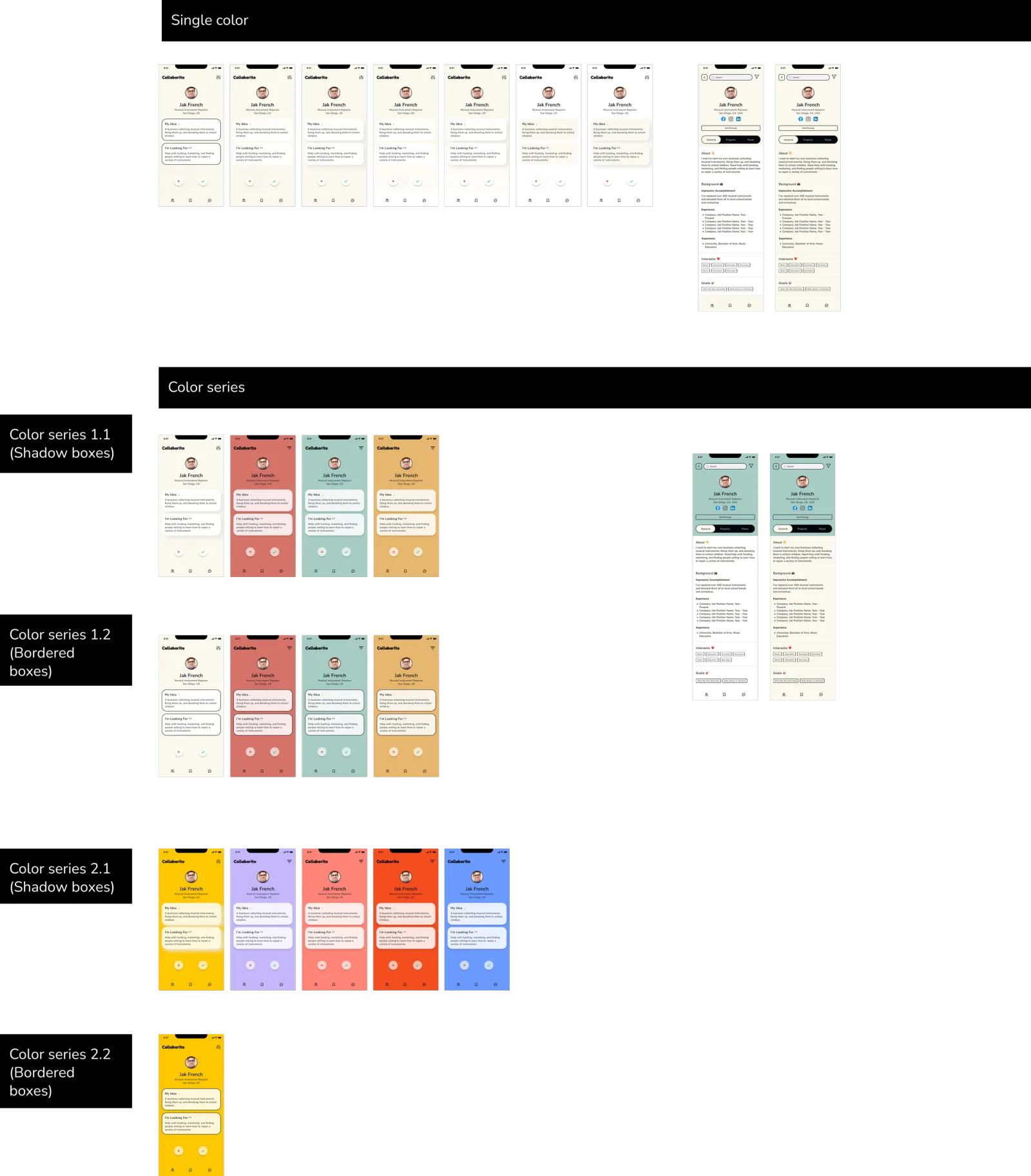
#4 Single vs. Multi-Colour Cards
Multi-color user profile cards — preferred
Multi-color profile cards enhance engagement and help users distinguish individual contributors in the text-heavy interface.
Results So Far
- Secured an HKD 50,000 grant from HKSTP, spent on a developer to support the CTO and on company registration
- 263 registered users with 21% WAU
- After a small ad test, users came organically from Reddit, product-launch sites and one-to-one outreach
- Two signed letters of intent: OWOW and What You Building
Ruby's Role
- Established lean startup methodology
- Conducted 5 interviews with PE analysts and 5 with executives
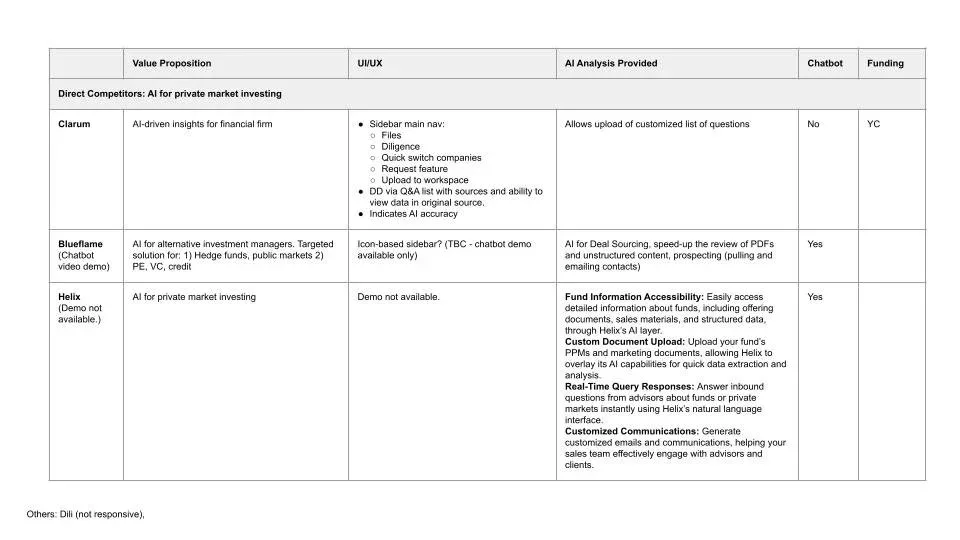
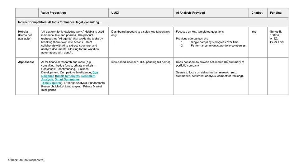
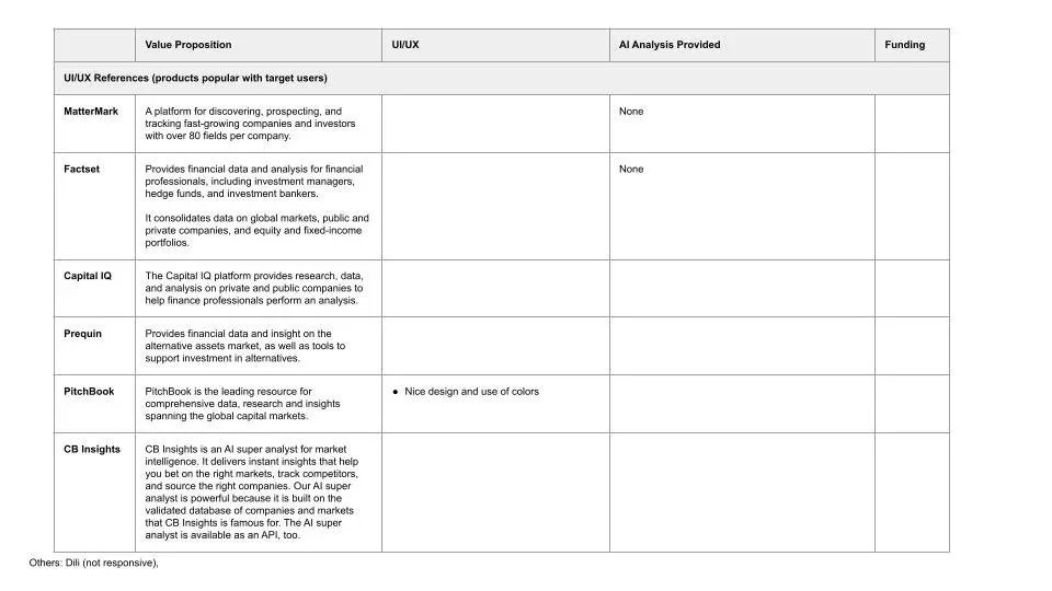
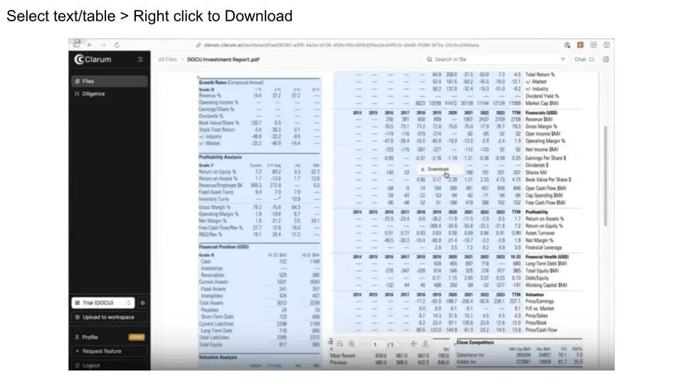
- Analyzed competing AI due diligence tools
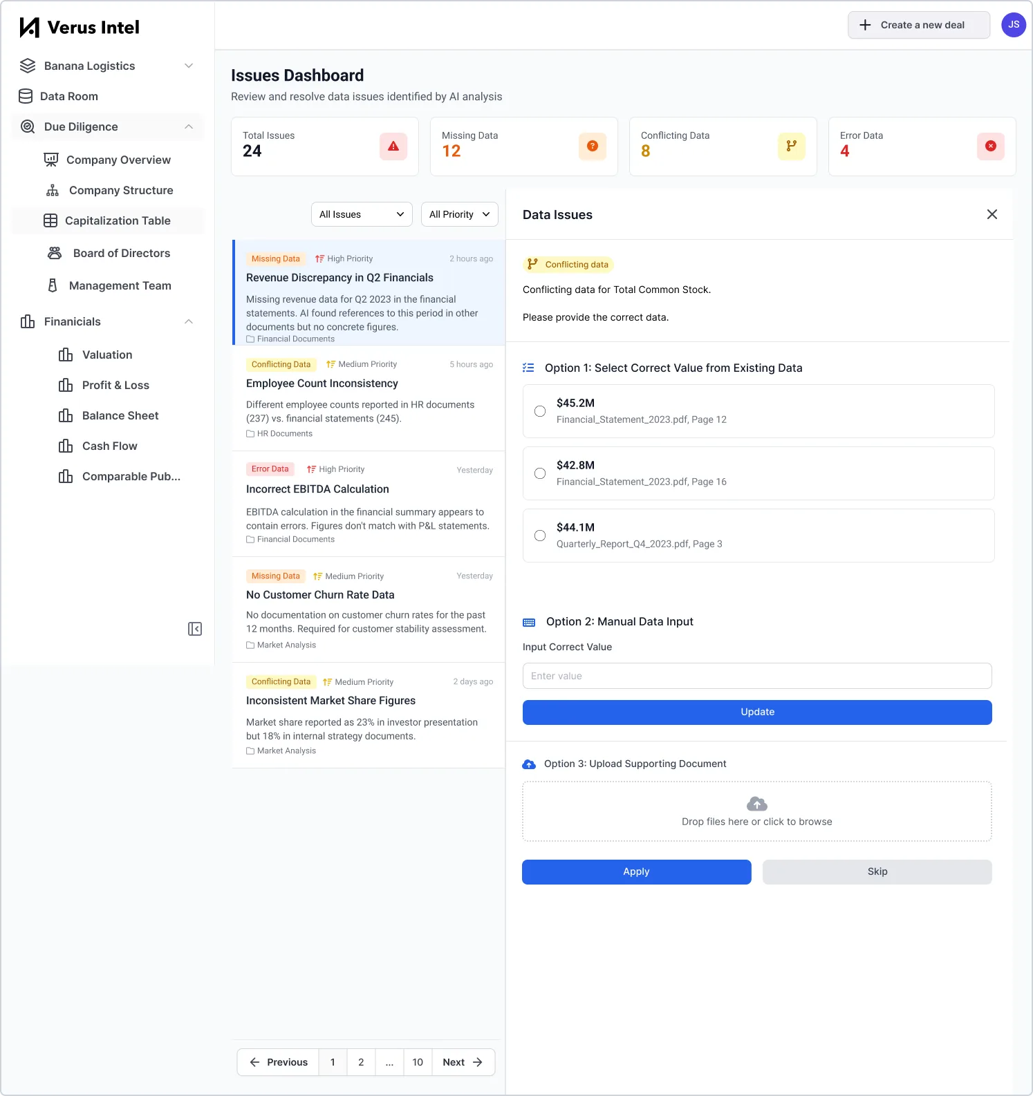
- Designed product
- Prompt engineering for LLM accuracy
Opportunity
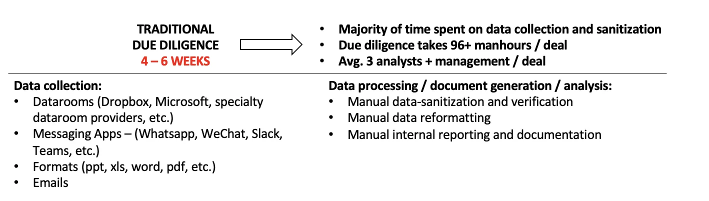
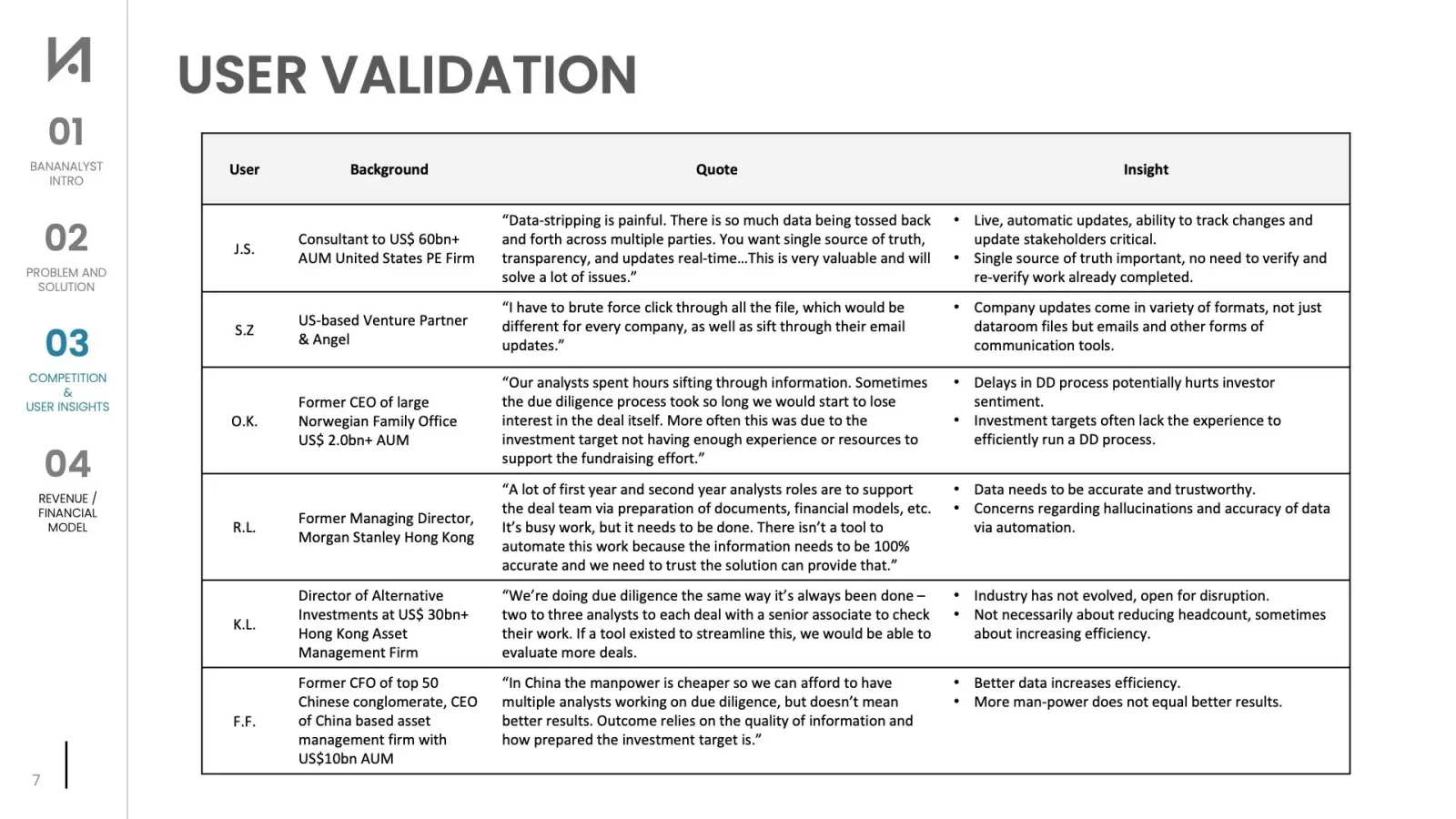
Private equity due diligence is a manual, time-consuming and inefficient process that can take around three analysts one to two months to perform depending on the deal size.
Current State
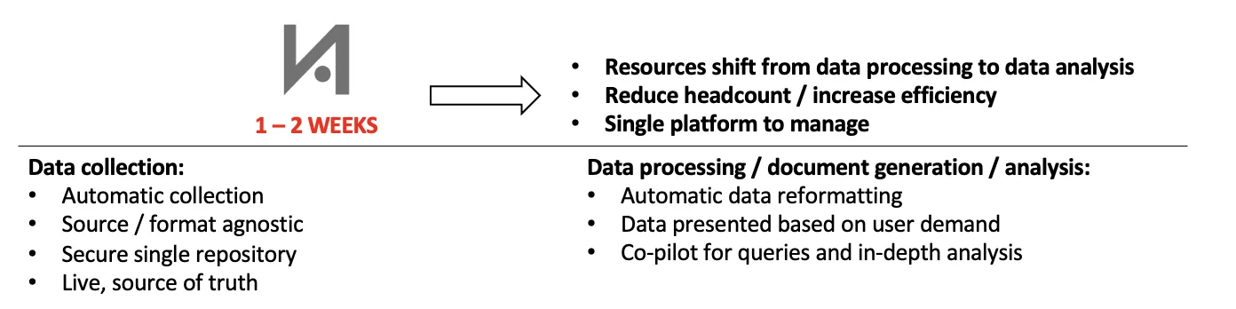
Solution
Design Iterations
Competitor Research
User Insights
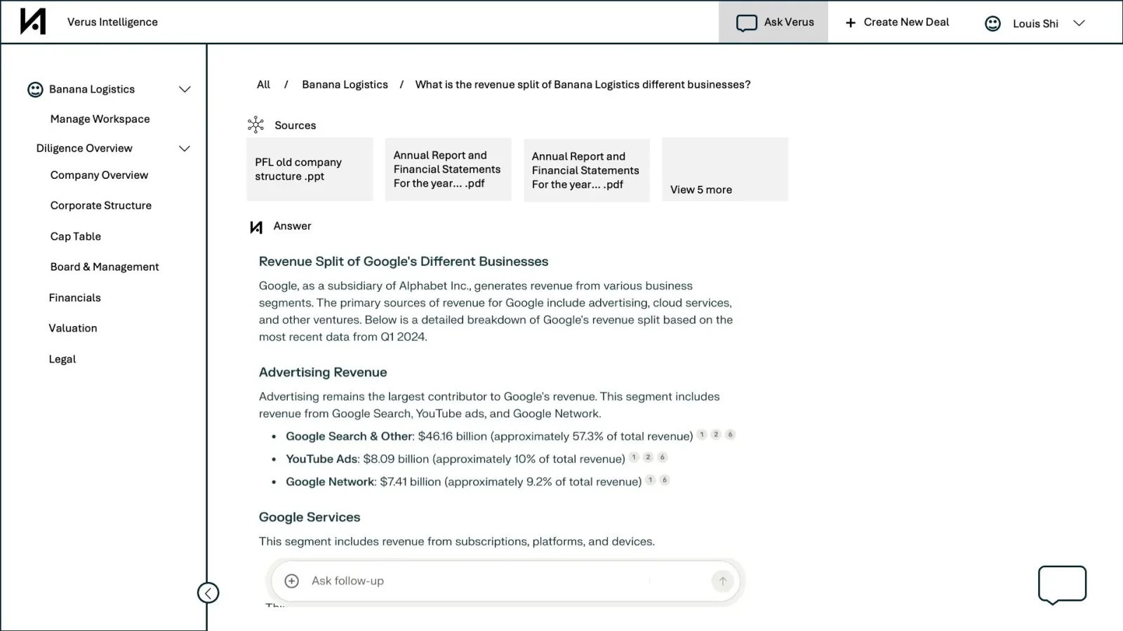
Design Decision #1: Navigation Layout
Horizontal Top vs. Sidebar
Top navigation — preferred
Top placement allows sidebar to be dedicated to deal-related navigation, helping users focus without distraction.
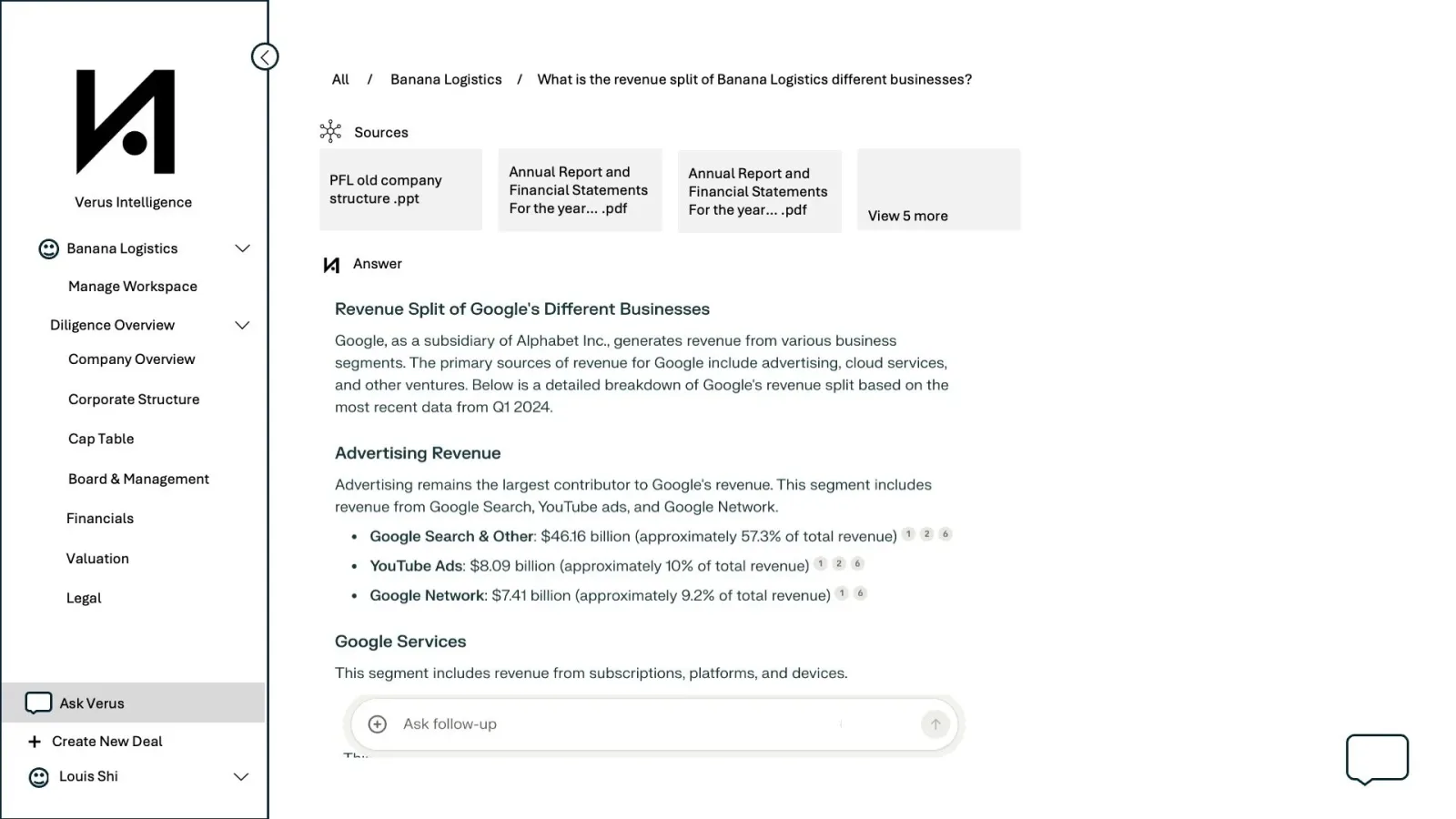
Design Decision #2: Chatbot Placement
Split-Screen vs. New Tab vs. Pop-up Chat Window
Use Cases:
- Analysts toggling between dashboard and chatbot
- Executives requesting updates/high-level info
Resolution:
- Pop-up window preferred for analysts
- Standalone tab suitable for executives
- Split-screen mode unnecessary due to redundancy and excessive space consumption
Hi-Fi Designs
Progress So Far
- Won third place for 2 out of 2 prizes at Techstars Startup Weekend San Francisco AI 2024
- Product development and design in-progress
- Fine-tuning AI accuracy
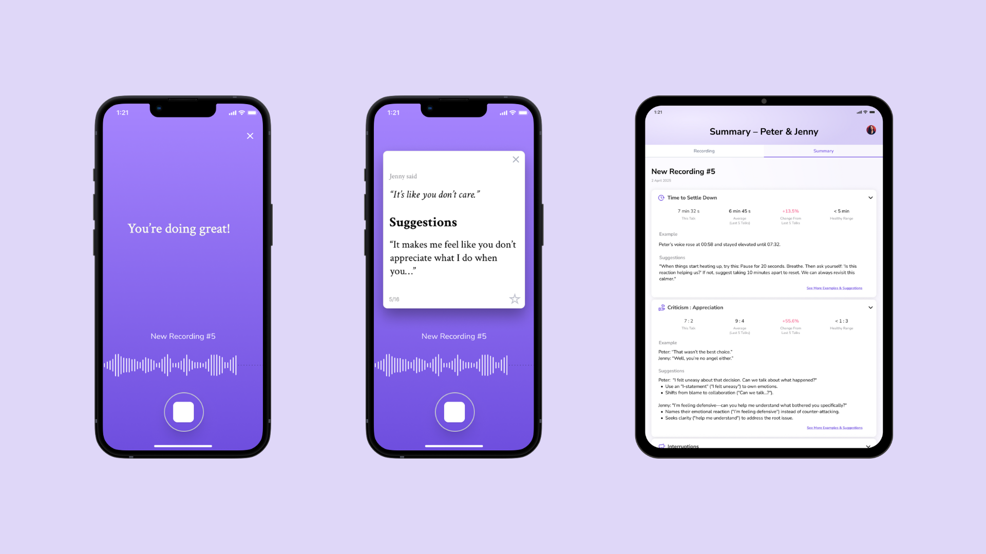
Overview
Estel is an AI-powered relationship communication coach app.
My Role
- Defined product vision and business strategy
- Developed pitch deck
- Led product design
Status
Customer development interviews with therapists in-progress.
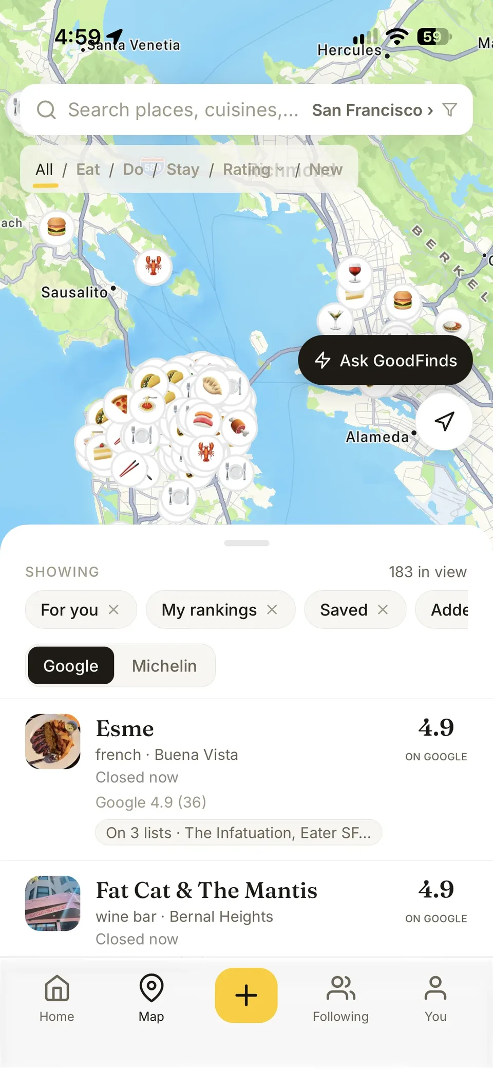
GoodFinds turns restaurant recommendations from people you trust – influencers, guides, chefs and friends – into a live map.
GoodFinds on the App Store →The problem
I kept losing good recommendations in screenshots and group chats, and a star average never says who is behind it or why. GoodFinds pulls the places out of wherever you saved them – an article, a list, a screenshot, or a bulk export of your Instagram saves – matches each one to its real listing, and ranks what you've actually been to by comparing it against your other visits, never by typing a number.
Key decisions
Ranked, not rated
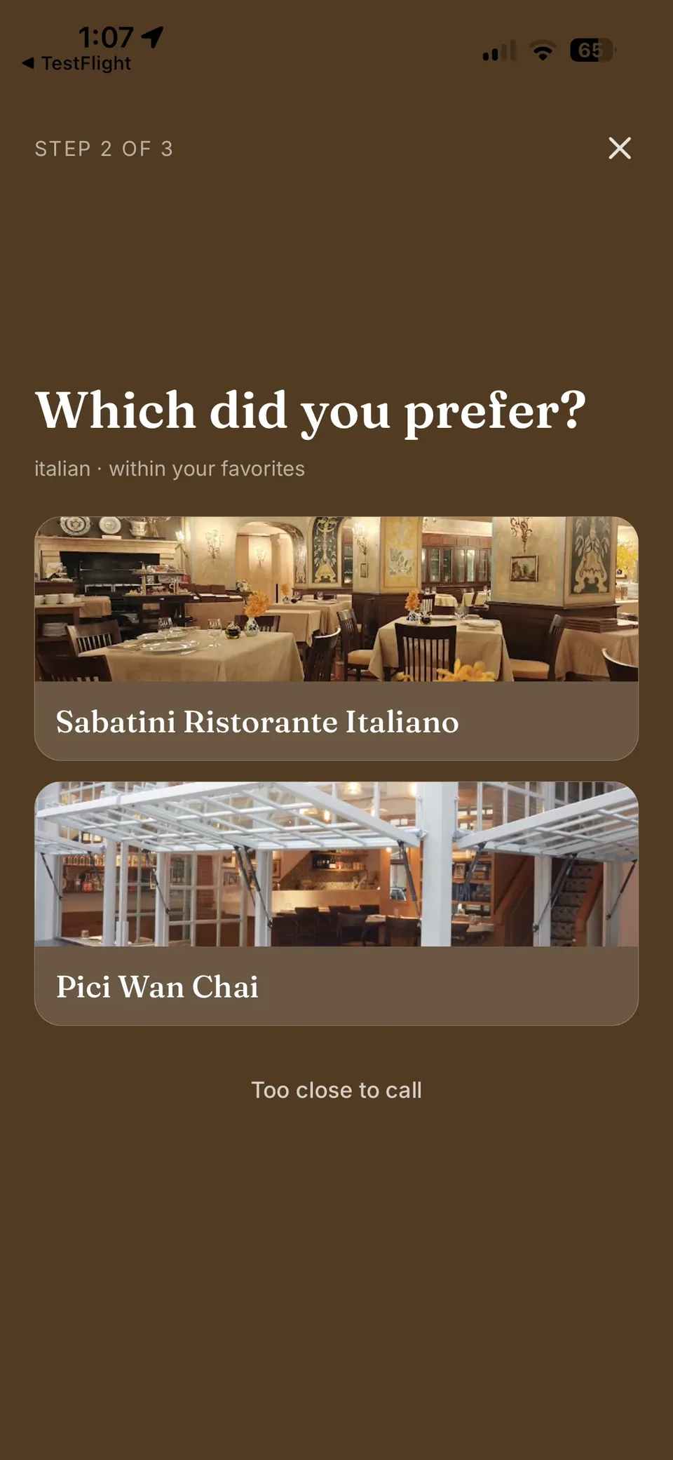
Logging a place asks for a verdict first – loved it, it was fine, not for me – then one or two "which did you prefer" comparisons against your other visits in that same bucket and cuisine, which places it into one ordered list. I rejected a five-star or ten-point score: absolute numbers cluster near the top no matter who is scoring, don't compare from one person to the next, and force a verdict when comparing two places is what people are actually reliable at.
A curator layer instead of a smarter score
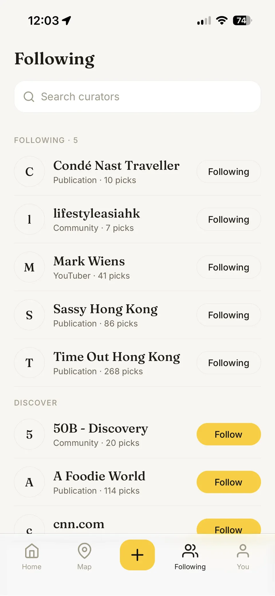
Rather than blend outside ratings into one algorithmic number, GoodFinds makes the people behind a recommendation followable: publications like Michelin and Time Out, and food creators like Fork Lore and Uncle K, whose picks filter the map as a layer and carry their own words on the place card. I chose this over a single blended score because a named opinion is legible in a way an algorithm's output isn't, and it works before anyone has rated anything – the exact problem an empty app has on day one.
Import-led discovery, not manual search-and-add
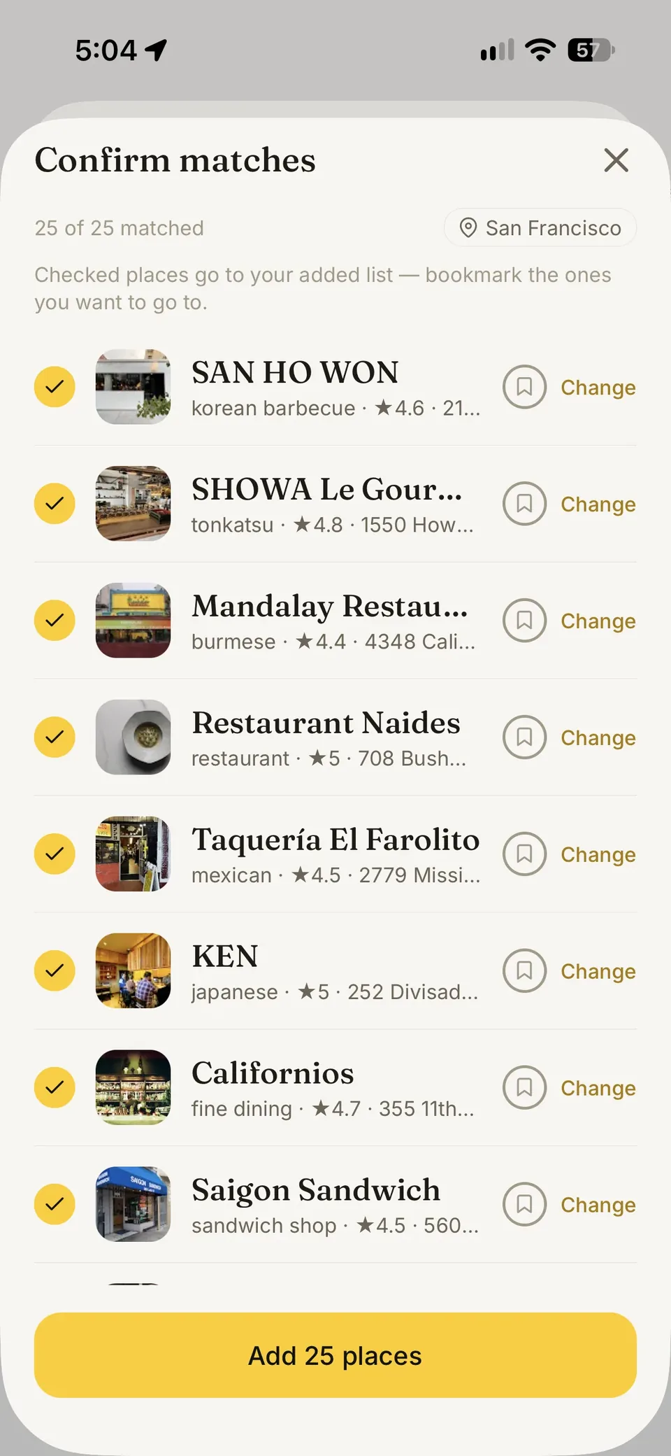
You paste a link, hand over a screenshot, or import your Instagram saves in bulk, and GoodFinds pulls the place names out, matches each to its real Google listing, and waits for you to confirm before anything is added. I rejected a search-and-add-only flow because recommendations already live in screenshots and group chats, not in a search bar people remember to open.
Where it is now
- Live on the App Store as GoodFinds, version 1.1.9
- The catalogue spans 14 home markets across Hong Kong, the US, Europe and East and Southeast Asia, each one pickable in settings
- Creator outreach so far: 19 messaged, 2 interested, 1 asked for more information, 1 declined, and 15 who haven't replied yet – that's where customer discovery stands
What I learned
An aggregate score that blends Google's rating, Michelin and GoodFinds' own ratings into one number is designed but not shipped – the map still sorts by Google's rating, labelled plainly as Google's, until enough of the app's own ratings exist for a blended number to mean anything different from it. I also don't yet track whether someone opens a curator's layer or just scrolls past it. Both are next, before another city or curator.
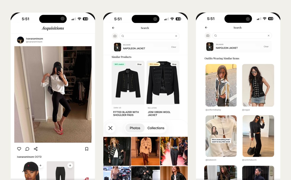
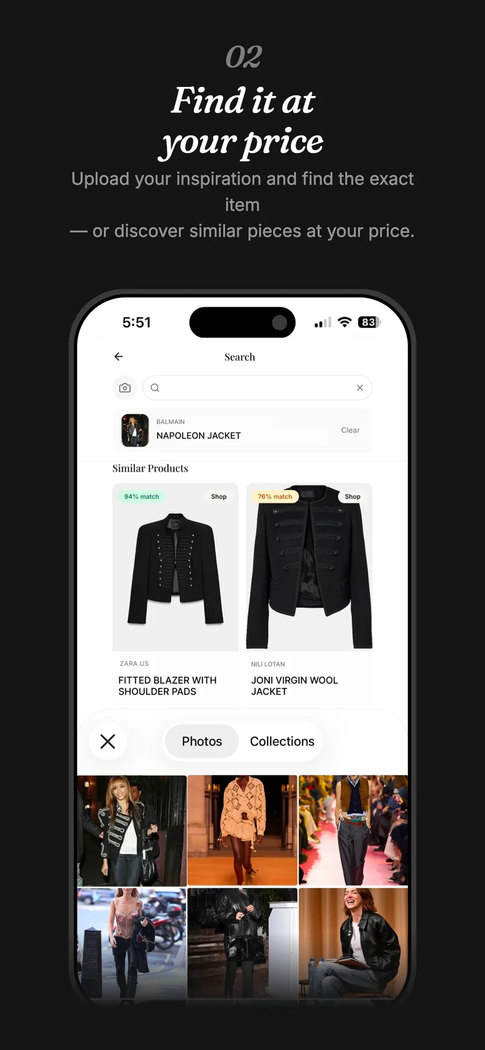
Someone posts an outfit and I want the actual jacket, not something close enough. Acquisitions is the app I built so a screenshot can shop itself.
Acquisitions on the App Store →The problem
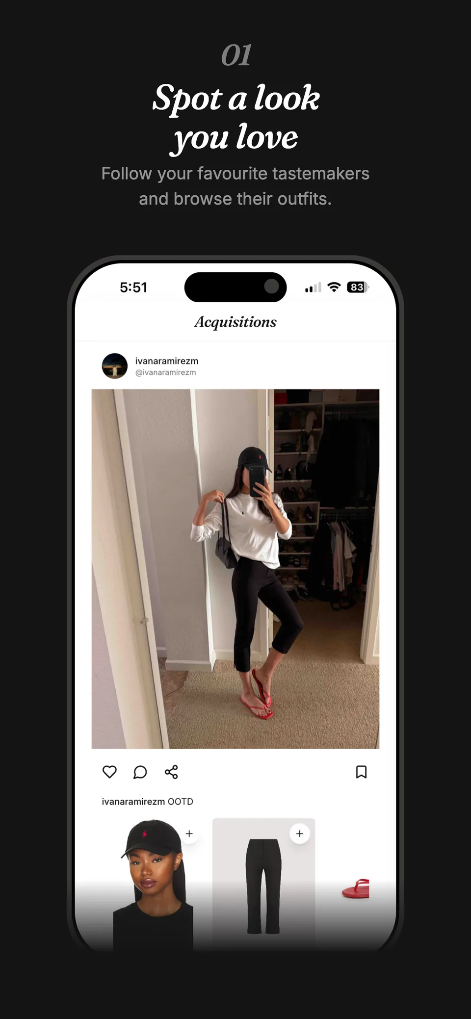
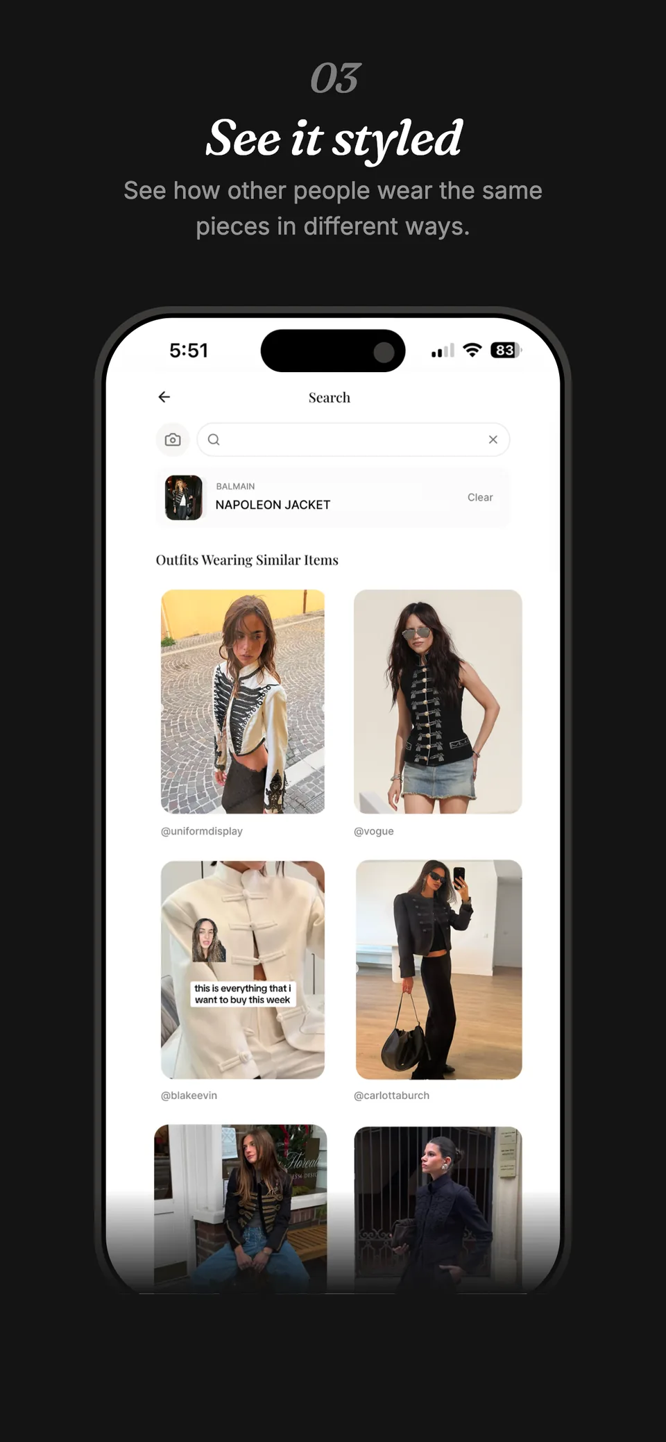
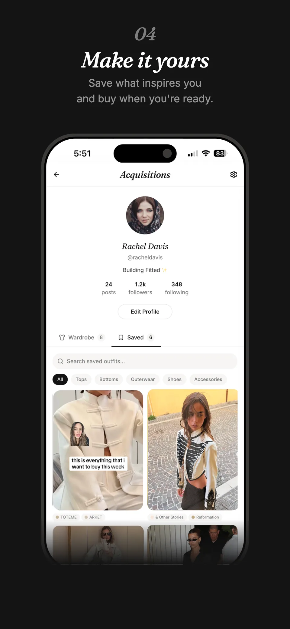
Outfits show up in feeds with no way to buy them, short of scrolling comments hoping someone named the brand. Incumbents like LikeToKnowIt and ShopMy seem to focus their efforts on serving influencers and have poor UI/UX for the end user. Acquisitions is a mobile-first social shopping app: follow tastemakers, scroll their outfit posts, and search by photo or text for the exact piece, or an affordable alternative. It started under the name Fitted. Underneath: Groq's llama-4-scout reads a photo's category, SigLIP2 embeds it, and Postgres with pgvector finds the closest match by cosine similarity.
Key decisions
Text search hits Postgres before it reaches the GPU
Most searches are typed words, not photos, so those run through Postgres full-text search first. Modal, the GPU service behind the embeddings, is only called for image searches. Routing every query through Modal instead would mean a GPU call for what a keyword index answers just as well.
Tap the garment instead of cropping it yourself
The app detects the separate garments in a photo and lets you tap the one you mean, instead of drawing a crop box. A free crop let people catch an extra item, like a worn bag, which threw off the search.
I chose the image models myself
At the time, AI coding tools could not browse the web, so they could not know which image search models were current or how they compared. I did that research myself and picked the two the app runs on: one to say what kind of garment it is looking at, another to turn the photo into something the catalogue can be matched against.
Cut Modal's idle window, not its accuracy
Modal billed for a model sitting warm between requests. Instead of shrinking the embeddings, I cut how long the GPU stays warm from ten minutes to three, with a light ping to stop it cooling: same model, same accuracy, less idle cost.
Where it is now
- Live on the App Store today as Acquisitions
- My own project, built with AI coding tools
- Catalogue scraped from eight influencers' ShopMy and ShopLTK pages
- A fixed set of 80 test searches, each with a known right answer, checks whether search got better or worse after every change
- Work has stopped: photo search never reached the accuracy I was satisfied with
What I learned
I dropped the project because the image search never reached the accuracy I was satisfied with, not with the off-the-shelf models available at the time and without a dedicated engineering team. It could not tell that wide-leg and straight-leg jeans were different, and to a shopper they are different products. The decisions worth keeping were about cost and what happens when things fail: how long to keep the search model running between requests, and what the app shows when a model takes too long to answer. AI coding tools wrote much of the code; choosing the models, deciding what to cut, and deciding when to stop were mine.
I wanted to write for different audiences from one account, so posts in Homeweb file into journals instead of one shared feed.
Open the demo →The problem
Most social apps give you one feed and one audience. Homeweb is a mobile-first journaling app: you write posts and file them into journals, themed collections that each carry their own privacy, so what you write for close friends never sits next to what is public. Discovery works by topic, not an engagement feed.
Key decisions
Privacy set per journal, not per post
Every post belongs to at least one journal, and the journal, not the post, carries the privacy: private, followers or public. The alternative was a per-post toggle, more flexible but meaning a decision on every single post. Setting privacy once, on the journal, means everything filed there inherits it.
Journals capped at 20, with a tunable escape hatch
Accounts hold up to 20 journals. The cap is a constant rather than a rule fixed in the schema, and setting it to zero switches the limit off, so it can change later without a migration.
Ship the feature now, add the model later
Tag suggestions, search and result ranking are live, running on simple rules rather than an AI model. The alternative was to hold all of them back until a real model was connected. Shipping the plain version first meant each flow could be used and judged straight away, and each one is built so the rules can be swapped for a model later without changing what people see. Moderation is built the same way but is not switched on yet. Semantic search is the one place a real model is already in use.
A "For You" feed you can explain
Posts are ranked by a plain formula: how recent, how much engagement, how closely the topics match yours. Homeweb's own line is follow topics, not algorithms, and a formula keeps that literal. You can see why a post sits where it does, rather than trust a model's read of you.
Where it is now
- Hosted as a demo at homeweb.rubytang.com, with a mix of real and sample content
- Sign-up is open
- Work paused in April 2026
- If it resumes, the first problem to solve is distribution
What I learned
Building it was not the hard part. What stopped the project was distribution: I could not think of a free way to market it, and a social journaling app has a chicken-and-egg problem, since writers need readers and readers need writers. I may come back to it after some lower-hanging fruit, and if I do, the first problem to solve is distribution, not the product.
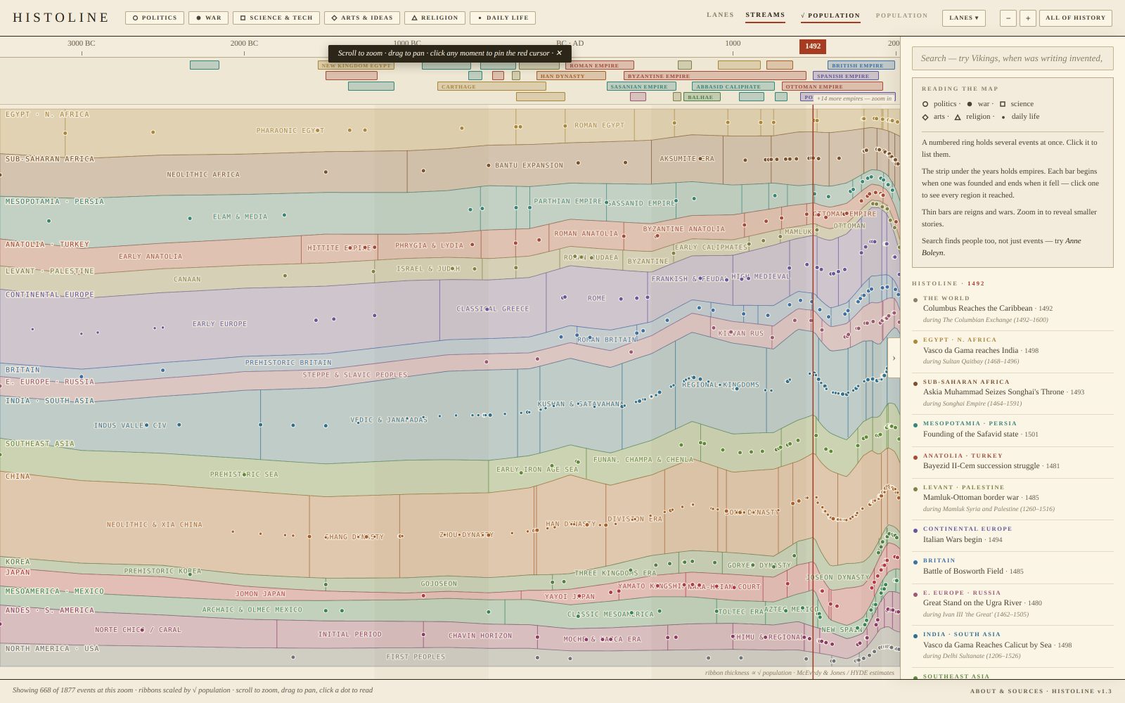
Pin a Year and See What Seventeen Civilizations Were Doing at Once
History is taught one civilization at a time, so the question I always had, what else was happening right then, never had an answer on one page.
Open Histoline →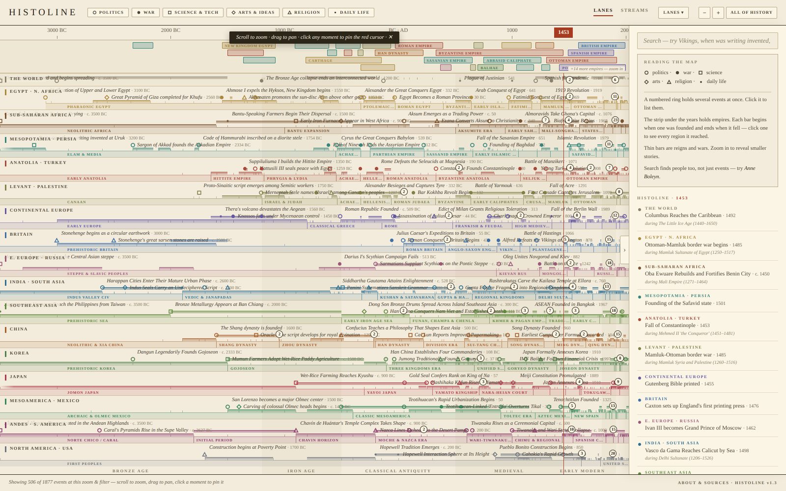
The problem
Every history book I have read runs down one lane. Ming China, then the Ottomans, then the Renaissance, each in its own chapter, each with its own dates. Nothing tells you that Michelangelo was painting the Sistine Chapel while Henry VIII was breaking with Rome and Ming China was banning sea trade to keep pirates, and the newly arrived Portuguese, off its coast. The timelines I found show either too many events or too few, cannot zoom to the level of detail I want, and are not something you can ask a question of.
What I wanted: pin any year and see what every part of the world was doing at that moment, at a high level first, with the detail one zoom away.
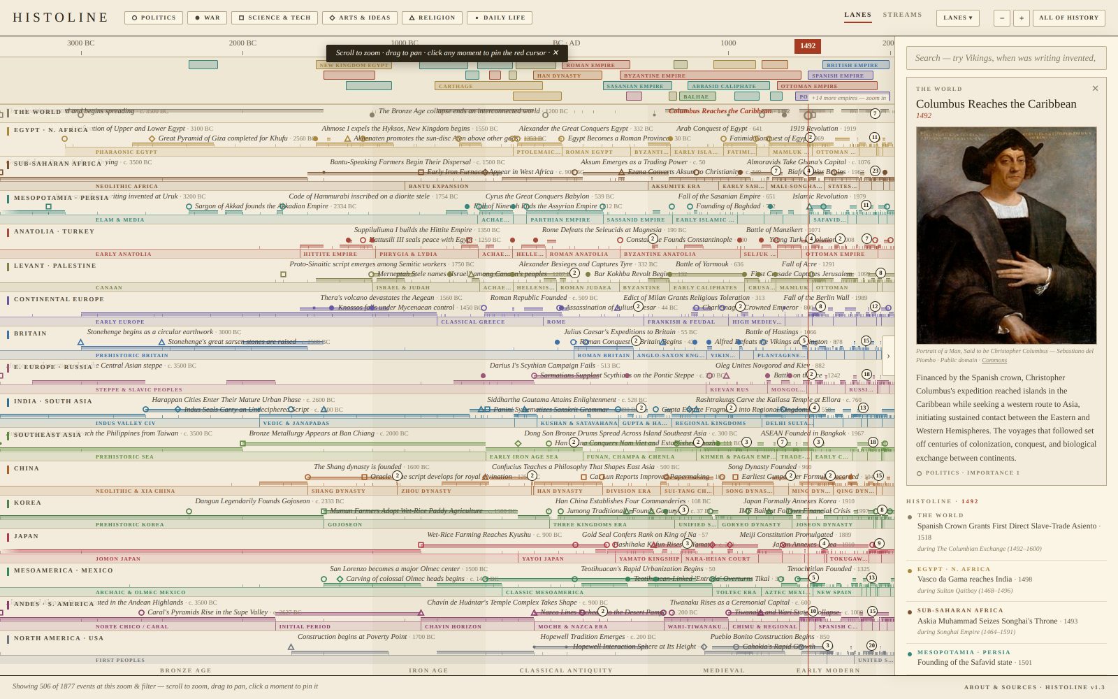
Key decisions
Trust is the product, so check everything against an outside source
A timeline that is mostly right is worse than useless, because you cannot tell which parts to believe. Once the range grew to 3500 BC through 2026, I had every dated item cross-checked against Wikidata's structured records. For the original eleven lanes, 981 empires, reigns, wars, eras, people and events found a match. About 700 agreed within Wikidata's own stated precision. Twelve were corrected. Forty-eight differ only by which standard periodisation you prefer, such as whether the Roman Empire ends in 395 or 476, and those stay as they are with the reasoning noted. The lanes added later went through the same pass on arrival.
The numbers are published on the page itself, in the About panel. That was deliberate. If you are asking people to trust a history site made with AI, the audit has to be visible, not claimed.
An importance budget, not an importance score
Showing everything at once is unreadable, so every event is ranked 1, 2 or 3: a landmark that bent its civilization, something significant to that lane's story, or texture like daily life and curiosities. The trick is that rankings are relative to each lane, with a budget per lane per era. Without that, Rome and Greece would flood the screen and West Africa would vanish. Zoom in and the lower tiers appear.
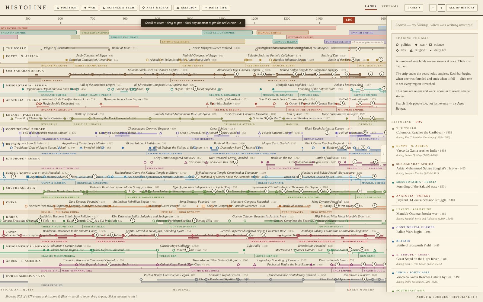
Contested history is named in each community's own terms
Where two communities remember the same event differently, both names appear. 1948 is shown as both Israel's Declaration of Independence and the Nakba. Characterisations that are disputed are attributed rather than asserted, and casualty figures use scholarly ranges.
Strips for what no single region owns
A World strip carries what no single region owns, such as technologies, diseases and trade networks that crossed continents, and an Empires strip shows polities that genuinely begin and end, from the Akkadian Empire to the Soviet Union. Select one and every region it never reached dims.
A second view where thickness means people
The Streams view draws each region as a ribbon whose thickness follows population estimates from McEvedy and Jones and from HYDE, scaled by square root so small regions stay legible. It is a claim about relative size, and it is labelled as one.
Where it is now
- Version 1.3, live at histoline.rubytang.com
- Seventeen civilizations, 3500 BC to 2026, with Empires, World and era strips
- Every dated item checked against Wikidata; the corrections are counted on the page
- Images from Wikimedia Commons, each credited with a link to the source file
What I learned
Building it took a weekend. Making it trustworthy took far longer, and that was the real work. The generation step is now cheap; the checking step is what turns a demo into something you might show a teacher.
I have no historians in my network, so the only thing that has checked the AI's work so far is AI. If you know the field and spot something wrong, tell me through the feedback form.
Next are the Prehistory and True Scale views, and a proper mobile treatment, since on a phone the timeline currently shows markers rather than labels.
I am not a historian and have no training in the field. Working with AI still let me build a timeline that may be close to accurate, which says something about what one person can now take on outside their own field.
One Board for Everything I Am Building With AI, Public and Private at the Same Address
I had more ideas than I could build and no honest way to see which ones deserved a weekend. So I built the board first.
Open the board →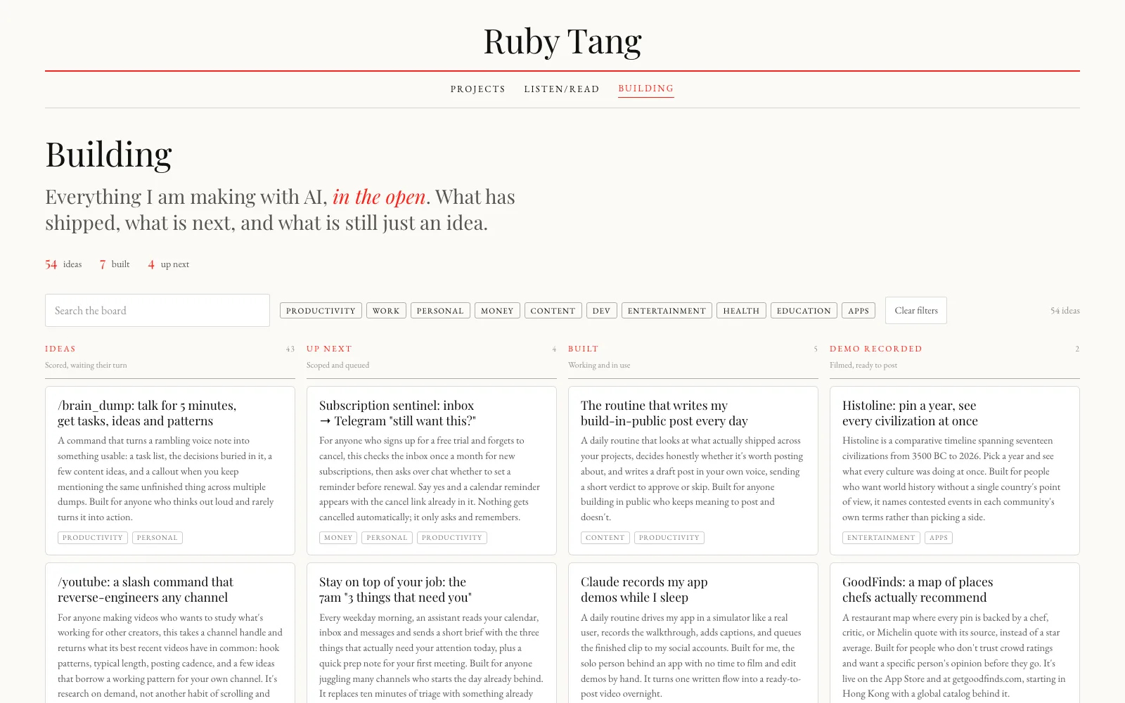
The problem
My hobby is turning small annoyances into things I can use: an app that finds where chefs actually eat, a timeline that answers what else was happening in 1492.
I built this board while taking one idea, GoodFinds, through the slow work of finding customers and product-market fit. With AI, building got cheap, so the list of things I could make got long, from a reminder that reads my inbox before a subscription renews to a language app that retells a story you already know. It grew faster than I could ship, and I had no way to decide what came next.
What it is
A kanban with six lanes, from Ideas through Up next, Building, Built, Demo recorded and Posted. Every card carries three ratings out of five, for how good it is, who it helps and how easy it is to copy, plus a separate rating for how well AI can build it, with the hardest part named in one line. Behind each card is a five-part case study: the problem and the evidence for it, the scope, the key design choice, the results or the metrics I would watch, and what I learned.
Key decisions
One address, two boards
Visitors and I go to the same link. The site checks for a sign-in and quietly serves a different page: visitors get the board with every card visible; I get the same board with every card and its priority editable.
No database. The repository is the store.
The obvious build was a database with an admin login. Instead, the board is generated from one file in a repository, and pressing Publish commits my edits back into that file. The site rebuilds itself a minute later. That gives me a full history of every change, nothing new to pay for or maintain, and one source of truth. The trade is a minute of delay between saving and seeing it live, which is fine for a board that changes a few times a week.
Drafts you edit, not boxes you fill
A draft to correct is far easier to finish than an empty field. Five fixed sections make sure every idea is checked against the same questions: is it useful to me and to others, and is it worth building.
It looks like the rest of my site
The board uses the same blush ground, the same single red and the same serif pairing as rubytang.com, rather than a dashboard look. It is a portfolio page that happens to be a working tool, and it should read that way.
Claude reads the board, writes to it, and builds from it
The plan, not yet run: everything is planned in the card. When I am ready, Claude builds it from the card, we iterate until I am happy, then it drafts the write-up for this site and a post about it.
Where it is now
I have not started using the board properly yet. Right now it is an idea dump with AI to help me sort through it. I will report back.