
Founding Collaborito, an AI matching platform for finding project collaborators

Overview
Collaborito is an AI-enabled platform that connects individuals with shared interests to collaborate on passion projects. Backed by the Hong Kong Science and Technology Parks (HKSTP), it currently has 263 registered users with 21% WAU.
Ruby’s Role
Team Building: Assembled team, recruiting a full-stack AI software engineer from Nvidia as CTO, UI/UX Designer and 2 software engineering interns.
Product Vision & Business Strategy: Set the strategic direction for Collaborito, outlining product vision, business model and roadmap.
Pitch Deck & Financial Model: Created investor-facing materials and financial projections to secure initial funding from HKSTP.
Product Design Leadership: Led product design and conducted iterative feedback sessions.
Go-to-Market Strategy: Planned and executed GTM strategy to acquire early adopters and build community.
Pitch Deck
Design Iterations
#1 Small avatars keep the focus on text-based user information
We chose smaller avatars to emphasize user information (e.g., skills, sought-after roles) rather than profile pictures
#2 Bordered textboxes reduce information overload and strengthen visual hierarchy
Goal
We aimed to design a user profile card that would efficiently convey critical details at a glance, such as a founder’s project description or a contributor’s skills and interests. The goal was to enable quick scanning while maintaining an engaging, user-friendly interface.
Challenge
Information Overload: Founders needed to detail their project and the specific help required, while contributors needed to list their skills and interests—all in a limited amount of screen space.
Visual Hierarchy: Helping users identify relevant information at a glance.
User Engagement: Shouldn’t feel like an endless wall of text—needs interactivity and visual clarity to encourage deeper exploration.
Process
Layout Experiments
Explored grids, text in boxes and single column layouts.
User Research & Testing
Conducted 5 usability tests with pilot users.
Received feedback that text in bordered textboxes felt more interactive and easier to read than large text blocks.
Refinement & Iteration
Settled on a card-based system with “key text” in textboxes to highlight critical details.
Grouping the skills section with the user’s main info (beneath the header) allowed users to switch their focus more seamlessly between the individual and the project.


Key Insights
Faster Scanning: Users took 57% less time to read text presented in bordered text boxes rather than a continuous block of plain text
Tangible Feel: Cleanly framed text and color-coded sections created a subtle 3D effect, giving the experience a physical, “tangible” feel, better replicating the human experience that users stated they desired
Positive Feedback: 33% increase in testers describing he layout as “straightforward” and “easy to navigate.”
#3 UGC posts and newsfeed
Deprioritise UGC posts and newsfeed - preferred
Considering the small user base expected at launch, we anticipate users would be less inclined to post as there will not be many people to interact with. Consequently, we have deprioritized User-Generated Content (UGC) posts and the newsfeed feature, choosing instead to focus on the core functionality of matching users.
#4 Single vs. multi-colour user profile cards
Multi-color user profile cards – preferred
Given the text-heavy nature of our user profile cards, we chose to use multiple colors to create a more engaging experience and to help users intuitively recognize that each card represents a different user.
Results So Far
Received HKD50,000 from HKSTP
263 registered users, 21% WAU with $0 marketing spend
User acquisition in-progress

Designing an AI tool for private equity due diligence
Ruby’s Role
Established lean startup methodology.
Conducted interviews with 5 private equity analysts and 5 executives to uncover common pain points.
Analyzed competing AI due diligence tools to identify gaps and differentiators.
Designed product.
Prompt engineering to increase accuracy of LLM.
Opportunity
Private equity due diligence is a manual, time-consuming and inefficient process that can take around three analysts one to two months to perform depending on the deal size.
Current State

Solution

Design Iterations
I designed our product based on competitor and user research.
Competitor Research


User Insights

#1 Navigation Layout: Horizontal Top vs. Sidebar
Top navigation – preferred
Placing the main navigation at the top of the interface allows the sidebar to be dedicated to deal-related navigation. This configuration helps users concentrate on navigating specific deals without the distraction of broader platform navigation.


#2 Chatbot Placement: Split-Screen vs. New Tab vs. Pop-up Chat Window
Use Cases
Analysts who frequently toggle between the dashboard and the chatbot to clarify or query specific metrics.
Executives who mainly use the chatbot to request updates or high-level deal information, requiring minimal dashboard use.
Resolution
For analysts, a small, pop-up chat window is preferred. This keeps the dashboard in view while allowing quick reference to AI-driven insights.
For executives, a standalone tab option is suitable for on-demand deep dives without needing the full dashboard.
We concluded that the split-screen mode was unnecessary, as its intended function is effectively covered by the pop-up chat window. Moreover, split-screen would occupy excessive screen real estate, detracting from user experience.
Hi-fi Designs

Progress So Far
Won third place for 2 out of 2 prizes at Techstars Startup Weekend San Francisco AI 2024
Product development and design in-progress; fine-tuning accuracy of AI

Founding an AI relationship communication coach app
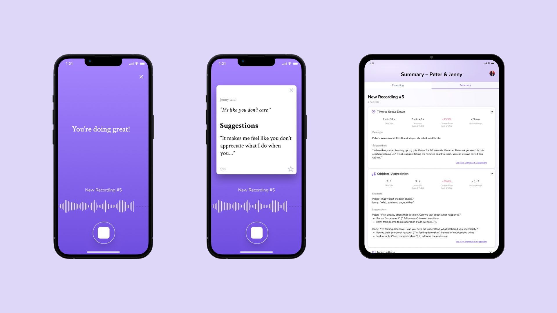
Ruby’s Role
Defined product vision and business strategy
Developed pitch deck
Led product design